HivePool: An Exploratory Visualization System for Honey Beehive Data

(This article belongs to the Special Issue on Special Issue on Multidisciplinary Sciences and Advanced Technology (SI-MSAT 2024) and the Section Horticulture (HOR))
Export Citations
Cite
Feng, T. , Columbia, S. , Campell, C. and Tashakkori, R. (2024). HivePool: An Exploratory Visualization System for Honey Beehive Data. Journal of Engineering Research and Sciences, 3(9), 61–74. https://doi.org/10.55708/js0309004
Tinghao Feng, Sophie Columbia, Christopher Campell and Rahman Tashakkori. "HivePool: An Exploratory Visualization System for Honey Beehive Data." Journal of Engineering Research and Sciences 3, no. 9 (September 2024): 61–74. https://doi.org/10.55708/js0309004
T. Feng, S. Columbia, C. Campell and R. Tashakkori, "HivePool: An Exploratory Visualization System for Honey Beehive Data," Journal of Engineering Research and Sciences, vol. 3, no. 9, pp. 61–74, Sep. 2024, doi: 10.55708/js0309004.
Honey bee health is crucial for global ecosystems, but traditional data analysis methods often struggle to capture the complex interplay between bee behavior and environmental factors. To bridge this gap, we developed HivePool, a novel data visualization and analysis tool designed to empower beekeepers and researchers with deeper insights into these interactions. This paper explores HivePool’s functionalities, focusing on its interactive visualizations and innovative time-oriented pattern recognition for event prediction. By leveraging time series visualization techniques, HivePool allows users to explore not only static relationships between environmental variables but also how these variables change dynamically leading up to specific events within the hive. The paper showcases HivePool’s effectiveness through two use cases: data-driven event exploration and example-driven event prediction. Overall, HivePool equips beekeepers and researchers with a powerful set of tools, facilitating a deeper understanding of bee behavior and environmental influences, ultimately leading to improved beehive health and management strategies.
1. Introduction
The alarming decline of honey bee colonies poses a significant threat, making it critical to unravel the mysteries behind Colony Collapse Disorder (CCD) [1]. Initiatives like the Appalachian Multipurpose Apiary System (AppMAIS) [2] have played a valuable role in collecting data on honey bee health. However, this data’s sheer volume and complexity often create a roadblock for researchers trying to identify meaningful patterns. Existing analysis tools, while helpful, often fall short in their ability to uncover subtle correlations hidden within these intricate, multidimensional datasets [3].
To address this challenge, we developed HivePool, a groundbreaking visualization system that empowers users to delve deeper, exploring the intricate relationships be- tween various time series data—temperature fluctuations, hive weight changes, and more — and specific events that occur within honey bee colonies, like swarming episodes. Unlike traditional analysis methods that may struggle to reveal these subtle connections, HivePool is specifically tailored to identify patterns between these diverse variables over time and how they relate to corresponding bee behavior.
The motivation behind HivePool stems from the recognition that existing data analysis tools often fail to illuminate the hidden connections within honey bee health datasets. Previous attempts, such as the visualization tool developed in our lab, provided some initial insights but lacked the sophistication needed to comprehensively analyze the rich- ness of multidimensional time series data [3]. Similarly, Beevis, while offering a comparison of multiple time series alongside the video, lacked the capability to define events specific to honey bee behavior and analyze how these multi- dimensional datasets influence or relate to bee activity [4]. HivePool builds upon these past efforts to bridge the gap and provide a more powerful platform for exploring the intricate temporal relationships within honey beehive data. By providing a platform to define honey beehive data events and explore the intricate interplay between time series variables and bee behavior, HivePool offers researchers and beekeepers a powerful tool for gaining a deeper under- standing of honey bee health and the factors that influence it. This paper delves into the functionalities of HivePool and showcases its effectiveness in uncovering hidden correlations within honey beehive data. By leveraging advanced visualization techniques and analytical tools, HivePool empowers users to extract valuable insights from these complex datasets, ultimately contributing to a more comprehensive understanding of honey bee health and paving the way for developing effective monitoring and management strategies. Through compelling case studies and feedback from domain experts, we demonstrate HivePool’s ability to unlock hidden patterns within bee data, facilitating informed decision-making in both beekeeping practices and research endeavors. We conclude by highlighting the significance of HivePool in advancing our understanding of honey bee behavior and its implications for colony health, while also outlining exciting avenues for future research and development.
2. Related Work
2.1. Honey Beehive Data Analysis
Understanding honey bee behavior hinges on effective data collection and analysis from beehives. Here, we explore prior research that has significantly contributed to these efforts. The AppMAIS and Beemon projects [5, 6, 7, 8] serve as prime examples, collecting diverse data (humidity, temperature, weight, audio, and video recordings) from honey beehives in Western North Carolina over the past thirteen years. This data provides a valuable foundation for further analysis.
Researchers have increasingly utilized sensor data to analyze honey bee behavior in relation to environmental factors. In [9], the authors proposed a method using a supervised machine learning classification algorithm to estimate colony health status and predict imminent collapsing states for beekeepers. In [10], the authors introduced a honey bee colony state identification solution using temperature data and fuzzy logic. In [11], the authors developed a multi- sensor platform for real-time and long-term measurement of relevant hive parameters and environmental conditions. While these studies establish the groundwork for hive data collection and basic analysis, they often lack comprehensive data visualization capabilities.
Visualization techniques play a crucial role in assisting honey bee analysis by leveraging human visual perception to analyze biological features or behaviors. In [12], the authors developed an automated 3D visual system that utilized two video cameras to observe and output 3D space trajectories and inflight statistics of target honey bees. In [13], the researchers visualized honey bee activity at hive entrances to monitor hive conditions and predict honey bee behavior. However, these approaches often lack an efficient visualization system with a user-friendly interface and the capability for comprehensive visual analysis, motivating the development of HivePool.
Detection and prediction of honey bee swarms have also attracted significant research interest, further motivating HivePool’s development. In [14], the authors presented a bee-condition-monitoring system incorporating a deep learning process to detect bee swarming. In [15], the authors proposed a method to detect swarming remotely. In [16], the authors disclosed a method for monitoring and predicting the swarming process within honey bee colonies using vibro-acoustic information, similar to the approach taken by Beemon.
HivePool builds upon these efforts by attempting to model the pattern using a time series of all variables pre- ceding the swarm event. This enables prediction based on historical data and identified patterns.
2.2. Multivariate Time Series Visualization
Time series data visualization has garnered significant interest among researchers, inspiring the development of HivePool. Several existing visualization tools and techniques have influenced HivePool’s design, particularly in the context of exploring multivariate time series data.
TimePool, a tool for visualizing multiple univariate time series, utilizes line charts – a concept similarly adopted by HivePool to represent time series of selected variables for multiple hives [17, 18, 19]. However, displaying numerous line charts can lead to clutter, hindering data comparison and individual item tracking [20, 21]. Variations like 3D line graphs and braided graphs offer minimal improvement and can be misleading with more data [22, 23]. ChronoLenses, which applies data transformations and displays results in line charts, can also be more cluttered than the original data [24].
To address clutter from multiple line charts, HivePool employs juxtaposed techniques, projecting them onto a set of time lines for each hive [17]. Similar approaches include line graph explorers [25], two-tone pseudo coloring [26], Spark Cloud [27], and Horizon Graphs [28], all of which display time series side-by-side to avoid overlapping data. Works like Interactive Horizon Graphs [29] allow users to adjust the baseline for pattern discovery, while Qualizon graphs [30] incorporate qualitative categories with bands. In [31], the researcher present time series with multiple detail levels and abstractions, combining quantitative and qualitative representations. However, juxtaposed techniques become less effective as the number of displayed time series increases due to cognitive overload [23, 32, 33].
Juxtaposed timelines are commonly used for event exploration in various domains like news analysis [34], communication analysis [35, 36], and medical research [37, 38, 39]. HivePool leverages juxtaposed timelines to facilitate analyses of time series data for multiple hives, applying them in a different context than existing works. Similar to those used in the matrix or line-based visualizations, sorting techniques are also employed to reveal patterns within the data [40, 41]. EVis serves as another significant inspiration for Hive- Pool [42]. It visualizes a multivariate time series preceding an event on a RadViz space. HivePool borrows this concept to define the Event Leash on the scatter plot for two environmental variables.
In [43], the author presented a set of line charts, one for each dimension, to visually analyze multivariate time series. Selecting a series in one chart would highlight it in all charts, enabling interactive exploration. While intuitive, this approach doesn’t explicitly reveal temporal relationships among the dimensions.
In [44], the authors employed a two-step dimension reduction process to project a group of multivariate time series as points in a 2D space. Users could examine feature contributions to clusters within the projection space. However, reducing each time series to a single point made it difficult to compare temporal trends in detail for a large number of series. In [45], the authors used animations and trajectories to show how values of multiple objects change over time in a shared 2D space. This approach can suffer from clutter and change blindness issues with many objects. Specifically, several methods have been proposed to visualize a single multivariate time series. In [46], the author divided a multivariate time series into time slices and projected them onto an MDS plot based on their similarities. The temporal order was mapped to the color of the projections. Time Curves [47] projected high-dimensional temporal data points to a 2D space and connected them by temporal order with a time curve. Characteristics of the time curve were extracted to reveal patterns in the evolving data. In [48], the authors projected snapshots of a dynamic network to dots in a 2D space and connected them using a curve. However, visualizing a large number of time series was not a focus of these approaches.
The trajectory-based financial time series visualization [49] is relevant to HivePool’s Event Leash concept. It plotted 2D time series as trajectories in a 2D space and clustered them based on high-dimensional feature vectors using a Self-Organizing Map [50].
2.3. Trajectory Similarity Search
Calculating the similarities of trajectories is a common computational task in many domains [51]. For our application, trajectory similarity is key to revealing similar patterns of change in environmental variables preceding specific events within a hive. HivePool, utilizing a domain appropriate similarity metric, searches for times within beehives with similar changes selected measured variables.
In [52], the authors provide an overview of trajectory similarity measures. Popular approaches vary in complexity, susceptibility to noise, and whether they account for temporal differences [53]. Existing literature divides these measures into being either metric or nonmetric. A distance measure is considered metric if it is unique, symmetric, non-negative, and satisfies the triangle inequality [52]. Non- metric measures do not meet these requirements.
Euclidean distance is perhaps the simplest measure of quantifying similarity between trajectories [54]. However, it requires trajectories to be of equal length, which may be too primitive for some applications. Fréchet distance and Hausdorff distance both measure shape similarity [55, 56], though unlike Hausdorff, Fréchet is a metric measure [52]. Yet, none of these three distance measures account for temporal similarity.
Selected spatiotemporal similarity measures include Dynamic Time Warping and Longest Common Subsequence. Dynamic Time Warping performs a recursive search to lo- cate the most similar points between trajectories [52, 57]. The longest Common Subsequence is a nonmetric measure that emphasizes robustness to noise [52, 58].
Similarity searching, finding the most similar trajectories within a large subset, can prove to be a computationally complex calculation. Searching large databases with many trajectories typically leads to a prohibitive runtime [59]. One attempt to devise an efficient searching algorithm is Wang and Liu’s algorithm, which supports queries personalized to users [59]. Supporting such queries provides a tailored user experience, but this algorithm does not account for temporal differences.
Moreover, unlike in many real-world scenarios, notably with GPS data where trajectories may not be of the same length [60], the same number of points between compared trajectories can be guaranteed for our data. Searches that accommodate trajectories of varying lengths are unnecessarily complex for our application. Frentzos and Theodoridis proposed a novel algorithm to efficiently conduct an index- based similarity search, which utilizes R-trees [61]. Torch is a trajectory search engine that features a trajectory similarity search and utilizes R-trees [62]. Torch supports various search queries, allowing users to investigate patterns among trajectories. Likewise, HivePool supports two versions of similarity searching to find the most similar trajectories between all variables or two user-selected variables.
3. Domain Background And Data
3.1. Data Collection Methodology
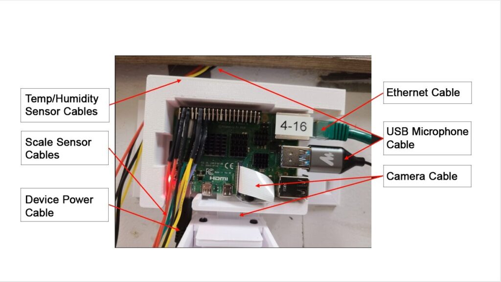
This research utilizes data collected through the App- MAIS Beemon system [63]. Beemon functions by acquiring data via a Raspberry Pi 4B (Rpi) and transmitting it to a designated server for primary analysis and visualization. Fig 1 provides a comprehensive view of the Beemon system’s hardware configuration.
Beemon System Hardware:
The core components of the Beemon system include a Raspberry Pi 4B (Rpi), a Raspberry Pi Camera Model 2, and protective casing for both units.
Data Acquisition:
- Environmental Sensors: Data pertaining to scale readings, humidity, and temperature is collected by the Rpi through Field-Programmable Gate Array (FPGA)
- Audio Data: A microphone connected to a USB port on the Rpi captures audio information.
- Video Analysis: Computer vision techniques are applied to video recordings to estimate bee activity levels (VideoFileSize) and bee traffic (departures and arrivals).
Data Used for HivePool:
Internal hive data:
- RMSDb: Noise level within the hive in Decibel scale
- Temperature: Internal hive temperature
- Humidity: Internal hive humidity External hive data:
- Hive Scale: Weight of the hive
- VideoFileSize: Indicator of bee activity level Derived data:
- Arrivals: How many bees come into the hive entrance within the video recording
- Departures: How many bees fly away from the hive entrance within the video recording
- Difference: The difference between Arrivals and Departures
This breakdown clarifies the data collection process and separates Beemon system details from the specific data used by HivePool for analysis.
3.2. Data Collection Timeframe
Our data collection focused on the active period of the hives, primarily daylight hours between 8:00 AM and 8:00 PM Eastern Standard Time (EST). For audio and video data, we captured one-minute segments at frequent intervals. Specifically, the Raspberry Pi (RPi) uploaded one-minute audio and video recordings every five minutes throughout the designated collection window, starting at 8:00 AM EST.
3.3. Challenges and Considerations
The Beemon system has undergone extensive testing for reliability under various weather conditions. However, occasional data gaps exist due to sensor malfunctions, power outages, or internet disruptions. Additionally, it’s important to note that while video recordings capture the hive entrance, audio recordings come from within. This means they are not perfectly synchronized despite being captured simultaneously. Furthermore, propolis, a resin used by bees to seal their hives, can sometimes coat sensors and microphones, potentially affecting humidity, temperature, and audio data quality.
Despite these limitations, the data collected using the AppMAIS Beemon system provides a comprehensive snap- shot of honey bee activity and environmental conditions. These datasets offer valuable insights into bee behavior and hive dynamics, even with inherent challenges. They serve as a strong foundation for developing advanced analytical and visualization techniques to unlock the complexities of honey bee ecosystems.
4. Motivation And Tasks
4.1. Motivation
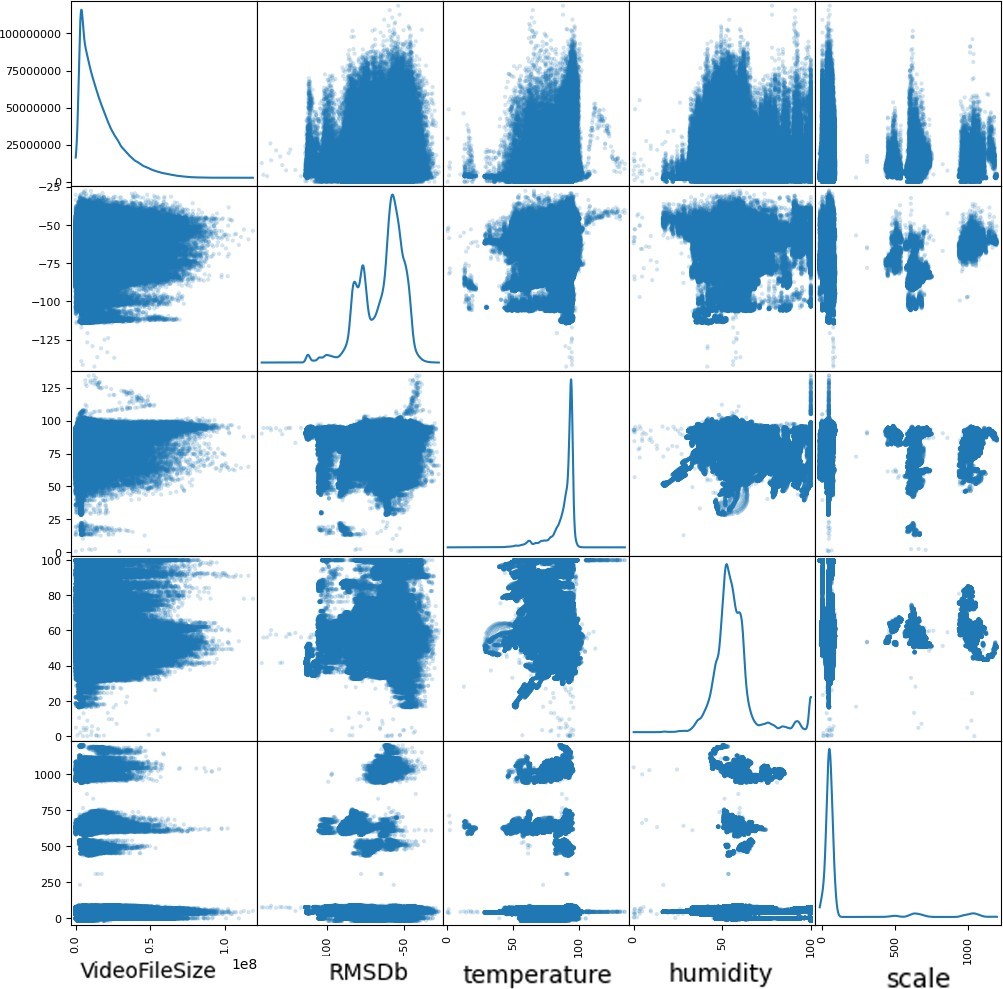
Unveiling the intricate dance between honey bee behavior and environmental factors is critical for understanding colony health and dynamics. Traditional data analysis methods, however, often struggle to capture these subtle connections within complex, multidimensional datasets. Here, the rich data collected by the AppMAIS Beemon system presents a unique opportunity to delve deeper into these relationships.
While an initial scatter plot matrix (Fig 2) might not reveal clear correlations between independent variables like video file size, audio loudness (RMSDb), temperature, humidity, and hive weight, the potential to uncover hidden patterns remains significant.
This research is driven by two key motivations:
4.1.1. Understanding the Impact of Environmental Changes
We aim to discover how fluctuations in environmental variables (e.g., temperature, humidity) influence honey bee behavior within the hive. By analyzing these relationships, we can gain valuable insights into bee health and colony well-being.
4.1.2. Predicting Honey Bee Swarms
Swarming is a natural process where a portion of a colony leaves to establish a new one. Predicting swarm events is crucial for beekeepers as it allows proactive management and minimizes potential honey production losses. However, accurately predicting swarms remains challenging due to the complex interplay of factors involved.
4.2. Tasks
Addressing these motivations translates to two primary tasks for HivePool:
4.2.1. Task 1: Data-Driven Event Exploration
This task explores user-defined events within the beehive data and identifies potential correlations with environmental factors. It comprises three subtasks:
- (T1-1) Events Definition: Since there are no predefined behavioral events within the data, users can leverage variables like VideoFileSize, RMSDb, and bee traffic data to define events of This might involve investigating variable distributions across hives and time to identify potential inflection points or thresholds that could be considered events.
- (T1-2) Environmental Pattern Definition: Once an event is defined, the goal is to explore the environ- mental factors (temperature, humidity, ) and how they change leading up to the event. This involves identifying patterns in these variables that might be associated with the chosen event.
- (T1-3) Potential Event Exploration: HivePool then quantifies the relationship between defined events and the time series of independent variables through correlation analysis. Assessing the strength and direction of these correlations helps us understand the influence of environmental factors on bee behavior and hive dynamics.
4.2.2. Task 2: Example-Driven Swarm Prediction
This task tackles the challenge of predicting honey bee swarms using historical data. It consists of the following subtasks:
- (T2-1) Training and Test Set Splitting: Swarm event data, typically collected by domain experts through video recordings, audio analysis, and direct observation, is the foundation for this task. The first step involves splitting these swarm samples into training and test The training set defines the characteristic time series pattern preceding a swarm, while the test set is used to evaluate the prediction accuracy.
- (T2-2) Multi-Variable Time Series Pattern Definition: Since swarm samples are often limited, directly applying machine learning techniques might be To address this, HivePool utilizes the concept of a multi-variable time series pattern. This pattern, vi- sualized using Detailed Leashes, depicts the changes in all relevant variables (temperature, humidity, etc.) leading up to a swarm event within the training set.
- (T2-3) Similarity Search: With the training pattern established, HivePool performs a similarity search across new This search identifies data points exhibiting similar patterns to the training swarm exam- ples, potentially indicating upcoming swarms within the beehives.
- (T2-4) Evaluation: The effectiveness of these predictions is then evaluated using the predefined test set. By comparing the similarity search results with the known swarm events in the test set, HivePool can assess its accuracy in predicting future swarms.
This breakdown clarifies the importance of swarm prediction for beekeepers and highlights the challenges involved. It also details how HivePool addresses these challenges through its multi-variable time series pattern approach and evaluation using a test set.
5. HivePool Visualization
HivePool prioritizes user-friendliness with its comprehensive visualization design. This design allows users to gain intuitive insights into how honey bee behavior interacts with environmental variables. The toolbox offers a variety of components, including line charts for visualizing trends, time maps for spatial representation of events, hive time bar charts for activity breakdowns within the hive, scatter plots for exploring correlations, and a powerful algorithm for uncovering similar patterns within the data.
5.1. Line Charts: Unveiling Trends in Bee Activity
Line charts are HivePool’s workhorse for visualizing honey bee behavior. They offer a clear view of a chosen variable’s time series data for each hive. Since bee data is time-oriented and often collected intermittently (typically 8 AM to 7 PM daily), HivePool employs a segmented timeline approach. Each day is represented by a continuous segment, allowing for scaling of daily data within it.
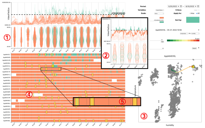
These line charts display the variable’s basic line graph for each hive, typically the event under analysis. Users can observe how the variable changes over time, following its path across each day’s segment as showin in figure 3 (1). To simplify the analysis, users can select individual hives to highlight their lines, isolating and comparing specific hive data to identify unique trends and patterns.
Interaction is key: users can zoom in or out to focus on specific timeframes or adjust the scale for different levels of detail. Hovering over data points reveals specific values, fostering deeper exploration. Ultimately, HivePool’s line charts empower users to analyze time series data across multiple hives. By enabling the visualization of trends, pat- terns, and correlations in bee behavior over time, line charts become a powerful tool for understanding hive dynamics and informing beekeeping and research decisions.
5.2. Time Maps: Decoding Bee Activity Throughout the Day
HivePool’s time maps allow users to examine the daily distribution of a chosen variable more closely. They visualize this data using bubbles arranged along a vertical line within each day segment of the timeline.
Each bubble represents a specific data point, with its position on the y-axis indicating the time of day and its size reflecting the variable’s value at that moment. This allows for a quick grasp of how the chosen variable fluctuates throughout the day within a hive.
Want to focus on a specific hive? No problem! Selecting a hive filters the time map, displaying only its data for focused analysis and pattern recognition across different days.
By visually depicting the variable’s distribution within each day, the time map helps users understand how it changes over time. Identifying trends, peaks, and patterns in the variable’s behavior provides valuable insights into hive dynamics and the influence of environmental factors. Seamlessly integrated with the line chart, the time map al- lows for comparing the variable’s daily distribution with its overall trend across multiple days. This lets users correlate specific time-based events with broader patterns observed in the line chart (See Fig 3 (2) for a sample: five-day line chart and time map for VideoFileSize in hive AppMAIS12R).
HivePool’s time maps go beyond the line chart, offering a granular view of a variable’s daily fluctuations. By pro- viding a deeper understanding of bee activity patterns and environmental influences, the time map empowers users to make informed decisions and conduct insightful analyses.
5.3. Hive Map: Spotlighting Activity Across Hives
HivePool’s Hive Map takes a unique approach to visualizing time series data. Imagine a bar for each hive, divided into colored segments that mirror the line chart’s threshold (think green for above threshold, orange for below, consistent across all visualizations).
These segments clearly show how the chosen variable is distributed across different hives over time, relative to the threshold. This makes it easy to identify periods when the variable exceeds or falls below the threshold for each hive, aiding in understanding hive dynamics and environmental influences.
For better comparison, hives can be sorted based on the total length of green or orange segments, depending on your preference. This sorting helps you see which hives experience the most or least time at a specific value, revealing patterns and trends across them.
The Hive Map also boasts interactive features to enhance user experience:
- Hive Selection: Clicking a hive’s name highlights it in the line chart and filters the time map, allowing focused analysis of a single hive’s data.
- Event Selection: Manually select an event and see similar events highlighted on the Hive Map. This lets you explore how hives behave similarly based on specific events or conditions, offering insights into hive dynamics and environmental factors.
By providing intuitive visuals and interactive features, the Hive Map empowers users to explore the chosen variable’s distribution across hives over time. This facilitates in-depth analysis of hive dynamics and environmental in- fluences, ultimately aiding informed decision-making and a deeper understanding of honey bee behavior. Fig 3 (4) shows the Hive Map right below the Line charts and Time Map.
5.4. Scatter Plots & Event Leash: Unveiling Environmental Triggers
While line charts, time maps, and hive maps paint a vivid picture, HivePool goes beyond static visuals. It offers scatter plots to explore relationships and distributions between two chosen environmental variables for each hive. However, scatter plots lack a time dimension. Enter the Event Leash, a novel feature that bridges this gap.
Scatter Plots: These plots allow users to visualize the correlation, distribution, and potential patterns between two selected environmental variables across different hives. This empowers users to identify potential connections between, say, temperature and humidity within each hive.
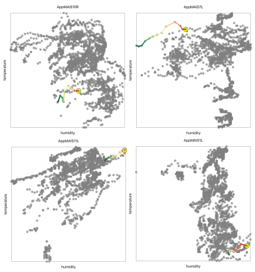
Event Leash: Unveiling Time-based Triggers: This innovative feature injects time-awareness into the scatter plot view. It displays a time series of the two environmental variables leading up to a selected event (visualized on the Hive Map). Imagine selecting a time point on the Hive Map – the Event Leash showcases the trajectory of both environmental variables right before that event.
The Event Leash’s path reveals how these environmental variables changed before the event. To make interpretation easier, HivePool color-codes the time order – allowing users to see the sequence of changes clearly. (Imagine a rainbow, with earlier points closer to the event being red and transitioning to violet as you move backward in time.) Fig 3 (3) shows an Event Leash on the Scatter Plot.
By integrating the Event Leash, HivePool takes scatter plots to the next level. This innovative feature allows users to go beyond static correlations and delve into the temporal dynamics of hive behavior and environmental influences. It empowers users to understand how changes in environmental variables might precede specific events within the hive.
5.5. Detailed Leash: Diving Deeper into Pre-Event Changes
The Event Leash shows how environmental variables shift before an event. But what if you want to scrutinize each variable’s individual story? Here’s where the Detailed Leash steps in.
The Detailed Leash provides a zoomed-in view of the time series data for each environmental variable leading up to the selected event. This detailed view allows users to see each variable’s specific patterns and trends and how they might contribute to the event’s occurrence.
Imagine a vertical line marking the event’s exact time. The Detailed Leash plots the time series data for each variable on either side of this line, showcasing their individual pre-event behavior. Fluctuations, trends, and anomalies become clear, allowing users to understand how each variable plays a role.
By examining the Detailed Leash, users can:
- Analyze how each variable evolves over time leading up to the event.
- Identify potential correlations and causal relationships between variables and the event.
- Discover potential predictive indicators associated with the event’s occurrence.
This in-depth analysis empowers users to:
- Gain a deeper understanding of the factors influencing the event.
- Make informed decisions about beekeeping practices or research interventions.
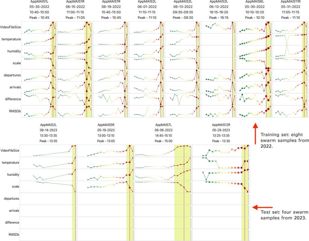
The time-oriented pattern for swarm samples in Fig 4 are defined using the Detailed Leash.
The Detailed Leash elevates HivePool’s analysis capabilities. Offering a granular view of individual variable behaviors facilitates a deeper understanding of the nuanced dynamics leading up to an event. This knowledge is crucial for informed decision-making and effective interventions in beekeeping and research.
5.6. Similarity Search: Unveiling Hidden Patterns in Bee Behav- ior
Behind the scenes, HivePool employs a greedy algorithm for similarity search. Within a user-defined date range and difference threshold, HivePool greedily searches for events with a set of leashes most similar to those of the swarm samples. An event, defined by the combination of its hive and leash start time, consists of a leash for each observed variable. By incrementally building the leashes and elimi- nating an event from consideration whenever its calculated difference exceeds the given threshold, HivePool avoids an expensive, exhaustive search.
5.6.1. Similarity Metric
HivePool utilizes a similarity metric that accurately calculates similarities amongst time series trajectories. Consider two leashes of the same length, a swarm and an event leash of a single variable, for which we need to calculate their trajectory similarity. HivePool calculates a similarity score between 0 and 1, where higher scores indicate more similar trajectories. The similarity between two corresponding points at index i on a swarm (s) and an event (e) leash, a and b respectively, is calculated using the following equation:
$$similarity(i) = 1 – \frac{|a – b|}{\max(\max(e), \max(s)) – \min(\min(e), \min(s))} \tag{1}$$
To avoid unexpectedly high similarity scores, we penalized differences at the head of a leash higher than those at the tail of a leash by applying weights to the calculated similarity score at each index. Let D’ be an array of length n, the length of both the swarm and event leashes, where the value at each index i is given by (i + 1)2. The array of weights, D, is then calculated using the following formula:
$$D(i) = \frac{D'[i]}{\sum (D’)} \tag{2}$$
The final similarity score, a value between 0 and 1, for two entire leashes is calculated using the following formula:
$$\sum_{i=0}^{n-1} similarity(i) * D(i) \tag{3}$$
5.6.2. Greedy Algorithm
Since there could be an excessively large number of leashes in the similarity search, HivePool pursues a greedy approach where events with difference scores that exceed the user-defined difference threshold are immediately dis- carded. Then, at the termination of the search, HivePool identifies a list of events whose final similarity scores are guaranteed to be below the difference threshold.
In the first step, we consider only the first point, the head, of each variable leash for an event. We compare these to the first point of each corresponding swarm variable leash to calculate an initial similarity score. If the average difference between all swarms’ leashes and the event leash is above the difference threshold, we eliminate the event from further consideration for each variable.
Once this initial search concludes, we may be left with numerous overlapping leashes, or leashes that contain the same time series data from the same hive. We remove overlapping events, greedily retaining only the event with the highest initial similarity score.
We repeat the similarity calculation for each point remaining in the leashes of the events still under consideration. Similarly, if any variable’s average difference exceeds the difference threshold at any calculation step, we discard that event. Once the search concludes, the events remaining are returned with each variable’s calculated final similarity score.
6. Analysis Cases
This section explores HivePool’s effectiveness in achieving its two core functionalities: data-driven event exploration and example-driven swarm prediction.
6.1. Case 1: Data-Driven Event Exploration
Jerry, a curious and meticulous beekeeper who is interested in understanding how internal hive conditions, specifically temperature and humidity, might influence the bees’ activity levels. To delve deeper into this question, Jerry decided to leverage the power of HivePool to unlock insights from beehive data. With HivePool at his disposal, Jerry embarked on a multi-step analysis process to explore the relationship between these environmental factors and bee activity.
6.1.1. Exploring Activity and Setting the Stage
Having identified temperature and humidity as key environmental factors of interest, Jerry turned his attention to selecting a suitable indicator for bee activity within HivePool. Because a larger file size in the video recordings captured by the beehive sensors might correlate with a higher number of bees present, Jerry opted for VideoFileSize as his metric. Within HivePool, Jerry explored the VideoFileSize data using two key visualization elements: line charts and time maps. The line charts provided a detailed view of how VideoFileSize fluctuated over time for each beehive, allowing him to identify trends and patterns in bee activity across different days. The time maps, on the other hand, offered a broader overview, displaying the distribution of VideoFileSize values across the entire dataset. This visual representation enabled Jerry to quickly identify days with unusually high or low levels of bee activity.
By strategically adjusting a threshold line overlaid on the VideoFileSize line charts, Jerry could highlight specific time periods where the video file size exceeded a certain value, potentially indicating increased bee activity within the hive. This selection was then reflected on the Hive Map (Fig 3 (1) & (4)). Here, green segments represented these periods of high VideoFileSize activity for each individual hive. The hives were further sorted based on their total duration in these green segments, providing Jerry with a quick comparison of activity levels across his beehives.
However, a closer inspection of the Hive Map revealed a potential data collection bias. One particular hive (App- MAIS7L) displayed a disproportionately long green segment compared to the others. This anomaly prompted Jerry to shift his focus to another hive (AppMAIS10L) that also exhibited a substantial period of high activity (bright yellow rectangle in Fig 3 (4)). He designated this specific time period, identified as T1-1, as the event of interest for further investigation within HivePool.
6.1.2. Event Leash and Pattern Recognition
Continuing his exploration within HivePool, Jerry delved deeper into the relationship between the chosen indicator (VideoFileSize) and the environmental factors of interest (temperature and humidity). Two key visualizations offered valuable insights at this stage.
The Scatter Plot, a powerful tool for revealing correla- tions between variables, displayed the relationship between temperature and humidity specifically for the hive Jerry had selected (Fig 3 (3)). Each data point within the scatter plot represented a specific point in time, with its position de- termined by the corresponding temperature and humidity values. By visually examining the distribution of these data points, Jerry could identify potential patterns or trends in how these two environmental factors interacted.
Overlaid on top of the Scatter Plot was the Event Leash, a unique visualization element offered by HivePool (Fig 3 (3)). Represented by a rainbow line, the Event Leash served as a dynamic timeline, tracing the changes in both temperature and humidity leading up to the selected event of interest (T1-1) – the period of high VideoFileSize identified earlier. By simultaneously observing the scatter plot and the Event Leash, Jerry could gain a more comprehensive understanding of how temperature and humidity fluctuated in relation to each other and how they evolved in the lead-up to the identified period of high bee activity. In this specific instance, Jerry noticed a potentially interesting pattern – a decrease in temperature followed by an eventual rise, occurring alongside a continuous increase in humidity. This pattern, displayed prominently by the Event Leash, offered a valuable clue for Jerry to consider as he continued his investigation into the factors influencing bee activity within his hives.
6.1.3. Similarity Search and Potential Events
With the high activity period (T1-1) identified for his chosen hive (AppMAIS10L), Jerry wasn’t finished yet. HivePool offered an additional layer of analysis – the ability to search for similar environmental patterns across other hives. In the background, upon selecting the event, HivePool initiated a sophisticated similarity search. This search algorithm scanned the data from all the beehives, searching for data points where the Event Leashes exhibited patterns that closely resembled the one associated with T1-1. These similar patterns could indicate similar environmental changes leading to high bee activity in other hives.
The results of this search were then displayed on the Hive Map (Fig 3 (4)) using dimmed yellow rectangles. Each rectangle represented a potential high activity event in an- other hive, identified by the similarity search algorithm based on the environmental patterns observed in T1-1. This visual representation on the Hive Map allowed Jerry to see how the environmental changes (represented by the green segments associated with high VideoFileSize in his initial event) aligned with the potential high activity events in other hives (represented by the dimmed yellow rectangles) (Fig 3 (5)). The spatial distribution of these potential events offered valuable insights into the potential influence of these environmental changes across his apiary.
Furthermore, HivePool’s interactive nature allowed Jerry to delve deeper. By clicking on each potential event high- lighted on the Hive Map, he could access the corresponding Event Leash for that specific data point. Examining these Event Leashes (Figure 5) provided a detailed view of how temperature and humidity evolved in those other hives leading up to their potential periods of high activity. Interestingly, all four potential event Leashes displayed a similar pattern to the one Jerry observed in T1-1: a drop in temperature followed by a rise, alongside a continuous increase in humidity. This remarkable consistency across multiple hives strengthened the potential connection between this specific environmental pattern and periods of high bee activity.
This exploration gave Jerry valuable insights into the potential relationship between temperature, humidity, and bee activity within his hives. HivePool’s interactive vi- sualizations and powerful similarity search functionality empowered him to analyze user-defined events and identify potential correlations with environmental factors across his entire apiary. This comprehensive approach offered by HivePool can be a valuable tool for beekeepers seeking to understand and manage the complex interplay between environmental conditions and bee behavior.
6.2. Case 2: Example-Driven Swarm Prediction
Gigi, a seasoned honey bee researcher, has meticulously documented honey bee swarm events for years. She has identified some swarm occurrences across 2022 and 2023 through video recordings and on-site observations. Driven by a desire to manage beehive health and prevent disruptions caused by swarming proactively, Gigi embarked on a mission to develop a model capable of predicting future swarm events.
Her initial approach involved constructing a machine learning model. With this model in mind, Gigi meticulously loaded data specific to the identified swarm occurrences. The data encompassed precise timeframes relevant to each swarm event: May 30th, 2022, to June 20th, 2022, for eight samples identified in 2022, and May 15th, 2023, to June 15th, 2023, for four samples observed in 2023. Following these preparations, Gigi attempted to train the machine learning model using the 2022 dataset, evaluating its ability to predict swarms using the 2023 dataset.
However, a significant hurdle emerged during this process: extreme class imbalance within the labels. The positive labels signifying swarm samples constituted a minuscule fraction of the data. In the training set, only eight data points out of a staggering 75,628 (from 24 hives) were la- beled as swarm events. Similarly, the test set has just four positive labels out of 147,351 data points (from 29 hives). This unbalanced distribution posed a substantial challenge for the machine learning algorithm. Due to the overwhelm- ing presence of negative labels (representing non-swarm periods), the algorithm struggled to learn the intricacies of the positive class (swarm events) effectively. Recognizing this limitation and the potential for misleading results, Gigi explored alternative swarm prediction approaches. This led her to HivePool, a visualization-based analysis tool that facilitates swarm prediction using a visually-built precedent time series pattern. By leveraging HivePool’s ability to identify similar environmental patterns preceding swarm events, Gigi hoped to gain valuable insights and improve her ability to predict future swarming occurrences.
6.2.1. Setting Up the Prediction Task
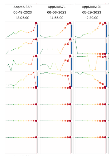
To initiate the analysis, Gigi first loaded the training set containing the swarm samples from 2022. HivePool responded by generating Detailed Leashes, one for each swarm sample (T2-1). These Detailed Leashes, serving as the foundation for predicting future swarms, visually represent the time series data for each swarm event. Un- like Event Leashes used in exploratory analysis, Detailed Leashes encompass all available environmental variables. This means each Detailed Leash displays a collection of time series line charts, one for every variable measured by the beehive sensors. By examining these charts, Gigi could gain a comprehensive understanding of how all environmental factors – temperature, humidity, video file size (indicating bee activity), scale (weight of the hive), honey bee traffic (if available), and RMSDb (a measure of hive vibration) – changed in the lead-up to each swarm event in the training data (Fig 4). However, a snag emerged when Gigi loaded the test set containing the 2023 swarm samples. Due to a data collection adjustment during that period, the 2023 samples lacked information on honey bee traffic and RMSDb. Fortunately, HivePool’s design allows it to adapt. Despite missing some data, HivePool could still harness the remaining variables (VideoFileSize, Temperature, Humidity, and Scale) to identify patterns within the data. These Detailed Leashes, encompassing all available variables for both the training and test sets, collectively define the multi-variable time series patterns that HivePool will utilize to predict potential swarm events (T2-2).
6.2.2. Performing the Similarity Search
Having loaded the training set, she initiated the search function. This prompted HivePool to embark on a similarity search across the 2023 data, utilizing the Detailed Leashes constructed from the eight training swarm samples from 2022 (T2-3). The search algorithm itself is designed to be adaptable. Recognizing that the 2023 data might have missing variables due to potential adjustments in data col- lection, the algorithm cleverly disregards missing entries. Instead, it focuses solely on the available variables that remained consistent across both datasets: VideoFileSize, Temperature, Humidity, and Scale. By comparing these four variables across the 2023 data points, the algorithm searched for instances that exhibited a high average simi- larity to the patterns observed in all eight training swarm Detailed Leashes. A user-defined threshold determined the level of similarity required for a data point to be considered a potential match. The outcome of this search yielded data points within the 2023 data that displayed a high degree of similarity to the environmental patterns that preceded swarm events in the training data from 2022. These identi- fied data points, representing potential swarm events based on similar environmental changes, were then transformed into Detailed Leashes for Gigi’s review. Additionally, these potential swarm events were highlighted on the Hive Map with dimmed yellow rectangles, providing a visual rep- resentation of the distribution of the hive and time. This combined visualization approach – Detailed Leashes and Hive Map markings – offered Gigi valuable insights into potential swarm occurrences within the 2023 data.
6.2.3. Evaluating the Results
Comparing these results to the actual 2023 swarm events, Gigi observed success. HivePool accurately predicted three out of four swarms (Fig 6). However, it also generated many false positives (Type I errors). 477 results points from the 147,351-point dataset were flagged, indicating potential algorithm refinement or threshold might be needed to better balance between accuracy and highlighting potential events. Despite this, Gigi was encouraged by HivePool’s ability to identify actual swarms based on environmental patterns. This initial success suggests promise for beekeepers seeking to proactively manage hives and prevent disruptions caused by swarming (T2-4).
6.2.4. Future Refinement
While the high false positive rate necessitates further development, Gigi is encouraged by the three successful predictions. This case study highlights HivePool’s ability to leverage historical data and time-oriented patterns to support proactive swarm management in beehives. By addressing the false positive issue through continued research, HivePool can evolve into a valuable tool for beekeepers to predict and manage honey bee swarms more effectively.
7. User Study
A user study assessed HivePool’s effectiveness for bee- keepers with limited data visualization experience. Participants, well-versed in honey beehive data, explored data exploration, environmental impact on bee behavior, and swarm prediction. This evaluated HivePool’s accessibility and potential to empower beekeepers with data-driven insights for informed decisions, without requiring extensive training in specialized visualization techniques.
7.1. Study Design
The user study lasted approximately 30 minutes. The initial 20 minutes focused on a guided tour led by the developer to introduce participants to HivePool’s core functionalities, including exploring beehive data, defining and finding potential events indicative of bee behavior, and even exploring its potential for swarm prediction. Following the guided tour, participants were empowered to take the reins for the remaining 10 minutes. This hands-on session allowed them to explore the system’s features independently at their own pace. Participants were encouraged to ask questions throughout the study to ensure a productive learning environment. Finally, to gather valuable feedback on their experience, participants completed a five-question Google Form after wrapping up their exploration of HivePool.
7.2. Participants
A total of 10 participants were enrolled in the study. The group comprised 8 graduate students with a strong background in honey beehive data and 2 experienced professors who brought their domain expertise to the table. A key characteristic shared by all participants was their lack of prior exposure to visual analytics tools. This selection process allowed us to simulate real-world scenarios where beekeepers, familiar with the intricacies of beehive data but new to visual analysis techniques, would be encountering HivePool for the first time. The user study allowed these participants to evaluate how HivePool’s visual analytics approach could assist them in analyzing honey beehive data and extracting valuable insights.
7.3. User Feedback
The user study yielded valuable feedback through a Google Form survey, with questions focusing on:
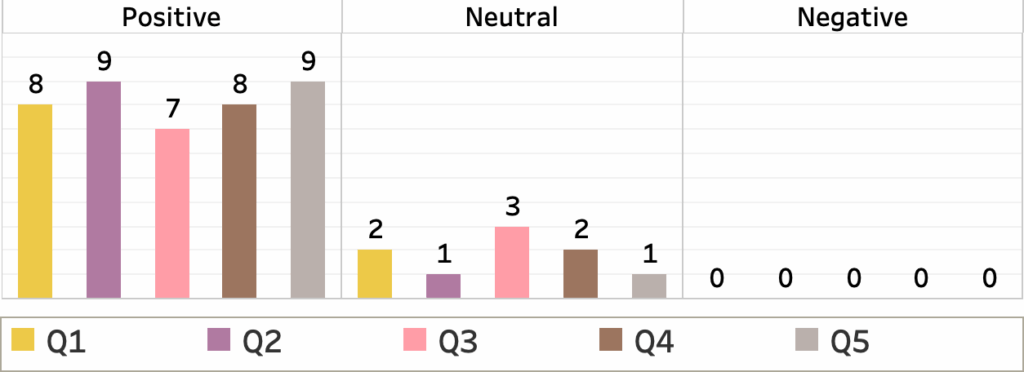
- (Q1) Did you find the system intuitive to understand? (System Intuitiveness): This question gauged how eas- ily participants understood HivePool’s Feedback was positive, with eight participants offering positive and one providing a neutral response. Here are some key quotes from participants: “Surprisingly intuitive for the number of different visualizations present.” “I appreciated the connection between the graphs and how responsive the design was!” “The interface controls were very intuitive.” “Once you understand the layout, it is extremely informative.“”All the labels, graphs, and charts were clear and concise.” There is one suggestion: “While this tool is going to be oriented towards professionals in the field, it might be helpful to add some more titles to provide quick context.“
- (Q2) Did you find the user interface of the visualiza- tion system easy to navigate? (User Interface Navi- gation): This question assessed the user-friendliness of HivePool’s interface for navigating and interacting with the Feedback was overwhelmingly positive. Here are some quotes: “The placement of user-determined options on the top right was very beneficial.” “It gave the user very powerful tools to manipulate and browse the data.” “Interactive items were labeled, which is good to see.” There is also a suggestion: “Adding more descriptive labels to certain sections of the tool could greatly aid in navigation and usability.“
- (Q3) Did the visualization system provide valuable insights into honey beehive data and swarm pre- diction? (Data Insights and Swarm Prediction): This question evaluated participants’ perception of Hive- Pool’s effectiveness in providing valuable insights into beehive data and aiding in swarm prediction. Feed- back was mostly positive, with seven participants offering praise and two providing neutral Here are positive quotes: “Swarm prediction did very well compared to the limited data about existing swarms and the number of swarms.” “I could see how this would be very helpful when investigating hive behavior or predicting swarms.” “This system’s visualization helped me have more insight into the trends of the honeybee data.” Some suggestions for improvement: “The error rate is a little too high right now to be helpful in identifying swarms.” “I would like it if the line plots in the swarm detection graphs had the area under the curve colored in. This would make it a lot easier to compare the plots at first glance.” “I would prefer that it includes a wider range of case studies on swarm events occurring.“
- (Q4) How useful did you find the visualizations in understanding the data and finding patterns? (Visualization Utility): This question explored the perceived usefulness of the visualizations in helping participants comprehend the data and identify Feedback was very positive, with eight participants offering praise and one providing a neutral response. Here are positive quotes: “The use of similarity metrics was great.” “Using leashes in general to find patterns was interesting and helpful.“”The visualizations were easy to understand while retaining detailed information.” “Users are able to make comparisons and draw conclusions from any of the con- trasting data points.” There are also some suggestions: “Some sort of outlier filter may be necessary.” “It might be beneficial to aggregate all of the entries highlighted in blue into a visual carousel… Incorporating a search bar feature within this carousel would further improve functionality by enabling users to filter entries based on specific dates and times.
- (Q5) Did the visualizations aid in making informed honey beehive data analysis decisions? (Decision- Making Support): This question assessed how well the visualizations facilitated informed decision-making about honey beehive data analysis. Feedback was overwhelmingly positive. Here are some key quotes from participants: “(The interaction) would be very helpful in identifying sensor ” “The similarity search seems to be very useful…I would look at times when the queen came out of the hive.” “I see incredible potential in its ability to allow easy exploration through the data.” “Analysis of the data becomes much more reliable and easier. “”The visualizations are the best aid in making those decisions.” “The insights provided by this tool would significantly boost my confidence in those choices.“
By analyzing the survey responses and comments, we can gain valuable insights into user experience and identify areas for potential improvement within HivePool.
8. Conclusion
This work investigated the potential of HivePool, a visualization-based analysis tool, for exploring honey bee- hive data and predicting swarm events. We explored a case study where a beekeeper leveraged HivePool to investigate the relationship between temperature, humidity, and bee activity within the hives. HivePool’s functionalities empowered the beekeeper to visually analyze user-defined events, identify correlations between environmental factors and bee activity, and explore potential patterns across his apiary. Another case study indicates that a researcher attempted to apply machine learning for swarm prediction but encountered challenges due to class imbalance. HivePool offered an alternative approach by identifying similar environmental patterns preceding swarm events in historical data.
There is always room for improvement. Here are three key areas we will focus on in future development:
- Incorporating Change Speed: HivePool will incorporate “change speed” as a search criterion, allowing users to explore how rapidly environmental variables fluctuate within the hive, providing a more nuanced
- Daily Time Series Generation: HivePool currently uses data collected every five minutes (8am-8pm), creating time series gaps. This limits Event Leashes to the current day, hindering analysis of multi-day patterns. To address this, a daily version of Hive- Pool will be introduced, aggregating data into daily points for continuous time series analysis of long-term environmental factors influencing bee behavior.
- Mitigating Type I Errors: The user study revealed high false positives in swarm To improve prediction accuracy, we’ll refine the search algorithm or user thresholds, potentially incorporating additional data (honeybee traffic, RMSDb) or advanced similarity metrics.
By addressing these limitations and incorporating user feedback, HivePool will evolve into a robust, user-friendly tool that empowers beekeepers with data-driven insights into hive health, swarm prevention, and overall apiary management.
9. Acknowledgments
We gratefully acknowledge funding from the North Carolina General Assembly (NC ROI grant 2021-24) for the AppMAIS project. We also extend our appreciation to Lowe’s Distinguished Professor Research Fund, rele- vant departments at Appalachian State University (Biology, Computer Science, Sustainability, Academic Affairs), and the undergraduate and graduate students who have con- tributed to the Beemon and AppMAIS data acquisition and hardware/software systems over the past eight years.
- O. US EPA, “Colony Collapse Disorder”, 2013, doi:10.1007/springerreference_123456.
- “Appalachian Multipurpose Apiary Informatics Systems (App- MAIS)”, doi:10.1007/springerreference_654321, NC ROI 2021-24.
- L. Richardson, C. Campell, R. Tashakkori, W. O’Brien, S. E. Davis, “Appmais simple data visualization app”, “SoutheastCon 2023”, pp. 366–370, 2023, doi:10.1109/SoutheastCon51012.2023.10114962.
- T. Feng, S. Arkle, C. Campell, R. Tashakkori, “Bee vis: A comprehensive honey bee data visualization, exploration, and analysis system”, “SoutheastCon 2024”, pp. 1274–1281, 2024, doi:10.1109/SoutheastCon52093.2024.10500272.
- R. Tashakkori, N. P. Hernandez, A. Ghadiri, A. P. Ratzloff, M. B. Crawford, “A honeybee hive monitoring system: From surveillance cameras to raspberry pis”, “SoutheastCon 2017”, pp. 1–7, 2017, doi:10.1109/SECON.2017.7925367.
- R. Tashakkori, A. S. Hamza, M. B. Crawford, “Beemon: An iot-based beehive monitoring system”, Computers and Electronics in Agriculture, vol. 190, p. 106427, 2021, doi:10.1016/j.compag.2021.106427.
- D. J. Kale, R. Tashakkori, R. M. Parry, “Automated beehive surveil- lance using computer vision”, “SoutheastCon 2015”, pp. 1–3, 2015, doi:10.1109/SECON.2015.7132991.
- R. Tashakkori, A. Ghadiri, “Image processing for honey bee hive health monitoring”, “SoutheastCon 2015”, pp. 1–7, 2015, doi:10.1109/SECON.2015.7133029.
- A. R. Braga, D. G. Gomes, R. Rogers, E. E. Hassler, B. M. Freitas, J. A. Cazier, “A method for mining combined data from in-hive sensors, weather and apiary inspections to forecast the health status of honey bee colonies”, Computers and Electronics in Agriculture, vol. 169, p. 105161, 2020, doi:10.1016/j.compag.2019.105161.
- A. Kviesis, V. Komasilovs, O. Komasilova, A. Zacepins, “Applica- tion of fuzzy logic for honey bee colony state detection based on temperature data”, Biosystems Engineering, vol. 193, pp. 90–100, 2020, doi:10.1016/j.biosystemseng.2020.03.011.
- S. Cecchi, S. Spinsante, A. Terenzi, S. Orcioni, “A smart sensor-based measurement system for advanced bee hive monitoring”, Sensors, vol. 20, no. 9, p. 2726, 2020, doi:10.3390/s20092726.
- C. Sun, P. Gaydecki, “A visual tracking system for honey bee (hymenoptera: Apidae) 3d flight trajectory reconstruction and analysis”, Journal of Insect Science, vol. 21, no. 2, p. 17, 2021, doi:10.1093/jisesa/ieab010.
- T. Sledevič, V. Abromavičius, “Toward bee motion pattern identi- fication on hive landing board”, “2023 IEEE Open Conference of Electrical, Electronic and Information Sciences (eStream)”, pp. 1–4, IEEE, 2023, doi:10.1109/eStream57549.2023.10123456.
- G. Voudiotis, S. Kontogiannis, C. Pikridas, “Proposed smart monitor- ing system for the detection of bee swarming”, Inventions, vol. 6, no. 4, p. 87, 2021, doi:10.3390/inventions6040087.
- A. Zacepins, A. Kviesis, E. Stalidzans, M. Liepniece, J. Meitalovs, “Re- mote detection of the swarming of honey bee colonies by single-point temperature monitoring”, Biosystems engineering, vol. 148, pp. 76–80, 2016, doi:10.1016/j.biosystemseng.2016.05.013.
- M.-T. Ramsey, M. Bencsik, M. I. Newton, M. Reyes, M. Pioz, D. Crauser, N. S. Delso, Y. Le Conte, “The prediction of swarming in honeybee colonies using vibrational spectra”, Scientific reports, vol. 10, no. 1, p. 9798, 2020, doi:10.1038/s41598-020-66836-2.
- T. Feng, Y. Hu, J. Yang, T. Polk, Y. Zhao, S. Liu, Z. Yang, “Timepool: Visually answer “which and when” questions on univariate time series”, “2023 IEEE Visualization and Visual Analytics (VIS)”, pp. 201–205, 2023, doi:10.1109/VIS54172.2023.00049.
- W. Aigner, S. Miksch, H. Schumann, C. Tominski, Visualization of time-oriented data, Springer Science & Business Media, 2011, doi:10.1007/978-0-85729-079-3.
- W. Playfair, The commercial and political atlas: representing, by means of stained copper-plate charts, the progress of the commerce, revenues, expen- diture and debts of england during the whole of the eighteenth century, T. Burton, 1801.
- B. Ondov, N. Jardine, N. Elmqvist, S. Franconeri, “Face to face: Evaluating visual comparison”, IEEE transactions on visu- alization and computer graphics, vol. 25, no. 1, pp. 861–871, 2018, doi:10.1109/TVCG.2018.2865234.
- A. Gogolou, T. Tsandilas, T. Palpanas, A. Bezerianos, “Comparing similarity perception in time series visualizations”, IEEE transactions on visualization and computer graphics, vol. 25, no. 1, pp. 523–533, 2018, doi:10.1109/TVCG.2018.2865235.
- L. Chittaro, C. Combi, G. Trapasso, “Data mining on temporal data: a visual approach and its clinical application to hemodialysis”, Journal of Visual Languages & Computing, vol. 14, no. 6, pp. 591–620, 2003, doi:10.1016/j.jvlc.2003.09.001.
- W. Javed, B. McDonnel, N. Elmqvist, “Graphical perception of multi- ple time series”, IEEE transactions on visualization and computer graphics, vol. 16, no. 6, pp. 927–934, 2010, doi:10.1109/TVCG.2010.162.
- J. Zhao, F. Chevalier, E. Pietriga, R. Balakrishnan, “Exploratory anal- ysis of time-series with chronolenses”, IEEE Transactions on Visual- ization and Computer Graphics, vol. 17, no. 12, pp. 2422–2431, 2011, doi:10.1109/TVCG.2011.195.
- R. Kincaid, H. Lam, “Line graph explorer: scalable display of line graphs using focus+ context”, “Proceedings of the working con- ference on Advanced visual interfaces”, pp. 404–411, ACM, 2006, doi:10.1145/1133265.1133331.
- T. Saito, H. N. Miyamura, M. Yamamoto, H. Saito, Y. Hoshiya,
T. Kaseda, “Two-tone pseudo coloring: Compact visualization for one-dimensional data”, “2005 IEEE Symposium on Information Visu- alization”, pp. 173–180, IEEE, 2005, doi:10.1109/INFVIS.2005.1532143. - B. Lee, N. H. Riche, A. K. Karlson, S. Carpendale, “Sparkclouds: Visualizing trends in tag clouds”, IEEE transactions on visualiza- tion and computer graphics, vol. 16, no. 6, pp. 1182–1189, 2010, doi:10.1109/TVCG.2010.194.
- J. Heer, N. Kong, M. Agrawala, “Sizing the horizon: the effects of chart size and layering on the graphical perception of time series visualizations”, “Proceedings of the SIGCHI Conference on Hu- man Factors in Computing Systems”, pp. 1303–1312, ACM, 2009, doi:10.1145/1518701.1518897.
- C. Perin, F. Vernier, J.-D. Fekete, “Interactive horizon graphs: improv- ing the compact visualization of multiple time series”, “Proceedings of the SIGCHI Conference on Human Factors in Computing Systems”, pp. 3217–3226, ACM, 2013, doi:10.1145/2470654.2466441.
- P. Federico, S. Hoffmann, A. Rind, W. Aigner, S. Miksch, “Quali- zon graphs: Space-efficient time-series visualization with qualitative abstractions”, “Proceedings of the 2014 International Working Con- ference on Advanced Visual Interfaces”, pp. 273–280, ACM, 2014, doi:10.1145/2598153.2598180.
- R. Bade, S. Schlechtweg, S. Miksch, “Connecting time-oriented data and information to a coherent interactive visualization”, “Proceedings of the SIGCHI conference on Human factors in computing systems”, pp. 105–112, ACM, 2004, doi:10.1145/985692.985707.
- K. B. Schloss, C. C. Gramazio, A. T. Silverman, M. L. Parker, A. S. Wang, “Mapping color to meaning in colormap data visualizations”, IEEE transactions on visualization and computer graphics, vol. 25, no. 1, pp. 810–819, 2018, doi:10.1109/TVCG.2018.2865147.
- J. Liu, A. Prouzeau, B. Ens, T. Dwyer, “Design and evaluation of interactive small multiples data visualisation in immersive spaces”, “2020 IEEE Conference on Virtual Reality and 3D User Interfaces (VR)”, pp. 588–597, IEEE, 2020, doi:10.1109/VR46266.2020.00079.
- M. Krstajic, E. Bertini, D. Keim, “Cloudlines: Compact display of event episodes in multiple time-series”, IEEE transactions on visu- alization and computer graphics, vol. 17, no. 12, pp. 2432–2439, 2011, doi:10.1109/TVCG.2011.179.
- M. T. Fischer, D. Seebacher, R. Sevastjanova, D. A. Keim, M. El-Assady, “CommAID: Visual analytics for communication analysis through interactive dynamics modeling”, Computer Graphics Forum, vol. 40, no. 3, pp. 25–36, 2021, doi:10.1111/cgf.14256.
- M. L. Larrea, D. K. Urribarri, “Visualization technique for comparison of time-based large data sets”, M. Naiouf, E. Rucci, F. Chichizola, L. De Giusti, eds., “Cloud Computing, Big Data & Emerging Top- ics”, pp. 179–187, Springer International Publishing, Cham, 2021, doi:10.1007/978-3-030-84825-5_16.
- M. Monroe, R. Lan, H. Lee, C. Plaisant, B. Shneiderman, “Tem- poral event sequence simplification”, IEEE transactions on visual- ization and computer graphics, vol. 19, no. 12, pp. 2227–2236, 2013, doi:10.1109/TVCG.2013.200.
- D. Klimov, Y. Shahar, M. Taieb-Maimon, “Intelligent selection and retrieval of multiple time-oriented records”, Journal of Intelligent Infor- mation Systems, vol. 35, no. 2, pp. 261–300, 2010, doi:10.1007/s10844- 008-0095-2.
- J. A. Fails, A. Karlson, L. Shahamat, B. Shneiderman, “A vi- sual interface for multivariate temporal data: Finding patterns of events across multiple histories”, “2006 IEEE Symposium On Vi- sual Analytics Science And Technology”, pp. 167–174, IEEE, 2006, doi:10.1109/VAST.2006.261421.
- B. L. Harrison, R. Owen, R. M. Baecker, “Timelines: an interactive system for the collection and visualization of temporal data”, “Graph- ics Interface”, pp. 141–141, Canadian Information Processing Society, 1994, doi:10.20380/GI1994.18.
- C. J. Atman, “Design timelines: Concrete and sticky representations of design process expertise”, Design Studies, vol. 65, pp. 125–151, 2019, doi:10.1016/j.destud.2019.10.001.
- T. Feng, J. Yang, M.-C. Eppes, Z. Yang, F. Moser, “Evis: Visually analyzing environmentally driven events”, IEEE Transactions on Vi- sualization and Computer Graphics, vol. 28, no. 1, pp. 912–921, 2022, doi:10.1109/TVCG.2021.3114867.
- P. Buono, A. Aris, C. Plaisant, A. Khella, B. Shneiderman, “Interactive pattern search in time series”, “Visualization and Data Analysis 2005”, vol. 5669, pp. 175–186, International Society for Optics and Photonics, 2005, doi:10.1117/12.587256.
- T. Fujiwara, N. Sakamoto, J. Nonaka, K. Yamamoto, K.-L. Ma, et al., “A visual analytics framework for reviewing multivariate time-series data with dimensionality reduction”, IEEE Transactions on Visual- ization and Computer Graphics, vol. 27, no. 2, pp. 1601–1611, 2020, doi:10.1109/TVCG.2020.3030341.
- R. Takami, Y. Takama, “Visual analytics interface for time series data based on trajectory manipulation”, “2018 IEEE/WIC/ACM Inter- national Conference on Web Intelligence (WI)”, pp. 342–347, 2018, doi:10.1109/WI.2018.00-58.
- S. Cheng, K. Mueller, W. Xu, “A framework to visualize tem- poral behavioral relationships in streaming multivariate data”, “2016 New York Scientific Data Summit (NYSDS)”, pp. 1–10, 2016, doi:10.1109/NYSDS.2016.7747810.
- B. Bach, C. Shi, N. Heulot, T. Madhyastha, T. Grabowski, P. Dragicevic, “Time curves: Folding time to visualize patterns of temporal evolution in data”, IEEE Transactions on Visualization and Computer Graphics, vol. 22, no. 1, pp. 559–568, 2016, doi:10.1109/TVCG.2015.2467851.
- S. van den Elzen, D. Holten, J. Blaas, J. J. van Wijk, “Reducing snap- shots to points: A visual analytics approach to dynamic network exploration”, IEEE Transactions on Visualization and Computer Graphics, vol. 22, no. 1, pp. 1–10, 2016, doi:10.1109/TVCG.2015.2468078.
- T. Schreck, T. Tekušová, J. Kohlhammer, D. Fellner, “Trajectory- based visual analysis of large financial time series data”, ACM SIGKDD Explorations Newsletter, vol. 9, no. 2, pp. 30–37, 2007, doi:10.1145/1345448.1345453.
- T. Kohonen, Self-organizing maps, Springer Science & Business Media, 2012, doi:10.1007/978-3-642-56927-2.
- K. Toohey, M. Duckham, “Trajectory similarity measures”, Sigspatial Special, vol. 7, no. 1, pp. 43–50, 2015, doi:10.1145/2811234.2811240.
- N. Magdy, M. Sakr, T. Abdelkader, K. Elbahnasy, “Review on trajectory similarity measures”, 2015, doi:10.1109/IntelCIS.2015.7397286.
- D. Hu, L. Chen, H. Fang, Z. Fang, T. Li, Y. Gao, “Spatio-temporal trajectory similarity measures: A comprehensive survey and quan- titative study”, IEEE Transactions on Knowledge and Data Engineering, 2023, doi:10.1109/TKDE.2023.3241234.
- C. Faloutsos, M. Ranganathan, Y. Manolopoulos, “Fast subsequence matching in time-series databases”, SIGMOD Rec., vol. 23, no. 2, p. 419–429, 1994, doi:10.1145/191843.191925.
- H. Alt, M. Godau, “Computing the fréchet distance between two polygonal curves”, International Journal of Computational Geometry & Applications, vol. 5, no. 01n02, pp. 75–91, 1995, doi:10.1142/S0218195995000064.
- M.-P. Dubuisson, A. K. Jain, “A modified hausdorff distance for object matching”, “Proceedings of 12th international confer- ence on pattern recognition”, vol. 1, pp. 566–568, IEEE, 1994, doi:10.1109/ICPR.1994.576361.
- E. Keogh, C. A. Ratanamahatana, “Exact indexing of dynamic time warping”, Knowledge and information systems, vol. 7, pp. 358–386, 2005, doi:10.1007/s10115-004-0154-5.
- M. Vlachos, G. Kollios, D. Gunopulos, “Discovering similar multidimensional trajectories”, “Proceedings 18th international conference on data engineering”, pp. 673–684, IEEE, 2002, doi:10.1109/ICDE.2002.994784.
- H. Wang, K. Liu, “User oriented trajectory similarity search”, “Pro- ceedings of the ACM SIGKDD International Workshop on Urban Computing”, pp. 103–110, 2012, doi:10.1145/2346496.2346515.
- W. Zheng, R. Zhou, Z. Zhang, Y. Zhong, S. Wang, Z. Wei,
H. Ji, “Understanding the tourist mobility using gps: How simi- lar are the tourists?”, Tourism management, vol. 71, pp. 54–66, 2019, doi:10.1016/j.tourman.2018.09.011. - E. Frentzos, K. Gratsias, Y. Theodoridis, “Index-based most similar tra- jectory search”, “2007 IEEE 23rd International Conference on Data En- gineering”, pp. 816–825, IEEE, 2006, doi:10.1109/ICDE.2007.367926.
- S. Wang, Z. Bao, J. S. Culpepper, Z. Xie, Q. Liu, X. Qin, “Torch: A search engine for trajectory data”, “The 41st international ACM SIGIR conference on research & development in information retrieval”, pp. 535–544, 2018, doi:10.1145/3209978.3210047.
- R. Tashakkori, A. S. Hamza, M. B. Crawford, “Beemon: An IoT-based beehive monitoring system”, Computers and Electronics in Agriculture, vol. 190, p. 106427, 2021, doi:10.1016/j.compag.2021.106427.
No related articles were found.