Biclustering Results Visualization of Gene Expression Data: A Review

(This article belongs to the Special Issue on Special Issue on Multidisciplinary Sciences and Advanced Technology (SI-MSAT 2024) and the Section Mathematical and Computational Biology (MCB))
Export Citations
Cite
Aouabed, H. , Elloumi, M. and Algarni, F. (2024). Biclustering Results Visualization of Gene Expression Data: A Review. Journal of Engineering Research and Sciences, 3(10), 54–68. https://doi.org/10.55708/js0310006
Haithem Aouabed, Mourad Elloumi and Fahad Algarni. "Biclustering Results Visualization of Gene Expression Data: A Review." Journal of Engineering Research and Sciences 3, no. 10 (November 2024): 54–68. https://doi.org/10.55708/js0310006
H. Aouabed, M. Elloumi and F. Algarni, "Biclustering Results Visualization of Gene Expression Data: A Review," Journal of Engineering Research and Sciences, vol. 3, no. 10, pp. 54–68, Nov. 2024, doi: 10.55708/js0310006.
Biclustering is a non-supervised data mining method used to analyze gene expression data by identifying groups of genes that exhibit similar patterns across specific groups of conditions. Discovering these co-expressed genes (called biclusters) can aid in understanding gene interactions in various biological contexts. Biclustering is characterized by its bi-dimensional nature, grouping both genes and conditions in the same bicluster and its overlapping property, allowing genes to belong to multiple biclusters. Biclustering algorithms often produce a large number of overlapping biclusters. Visualizing these results is not a straightforward task due to the specific characteristics of biclusters. In fact, biclustering results visualization is a crucial process to infer patterns from the expression data. In this paper, we explore the various techniques for visualizing multiple biclusters simultaneously and we evaluate them in order to help biologists to better choose their appropriate visualization techniques.
1. Introduction
Gene expression profiles, generated by advanced high-throughput technologies like microarrays, are depicted in a matrix format where rows correspond to genes, columns to experimental conditions and each matrix entry to the expression level of a gene under a specific condition. Clustering has been the primary technique for analyzing such voluminous genomic data, focusing on grouping genes (rows) that show similar expression across all conditions (columns), as noted by [1]. Traditional clustering methods including hierarchical clustering [2] and k-means clustering [3] have proven effective in gene expression analysis. However, to glean novel insights from biological data such as identifying genes associated with cancer progression, determining functions of unknown genes or developing new treatment approaches, it’s essential to perform clustering across both dimensions: genes and conditions. Indeed, the field of biclustering or co-clustering has emerged as a valuable tool in genomic data analysis. This machine learning technique identifies groups of biological entities, such as genes, that display comparable behaviour under specific conditions. It is first used to analyze gene expression data in 2000 by [4]. Biclustering differs from traditional clustering in two key theoretical aspects: bi-dimensionality which involves grouping genes and conditions together and overlap which permits genes to be part of multiple biclusters at the same time. In [5], the author conducted a comprehensive review of various biclustering algorithms, categorizing them based on their search methodologies.
Visualizing biclustering output allows for the identification of co-regulated gene clusters and experimental conditions with similar gene expression profiles. In fact, examining biclustering results visually provides a deeper understanding of the underlying relationships and trends within the expression data [6]. Nevertheless, due to the unique attributes of biclustering which are bi-dimensionality and the potential for overlaps, the representation of gene expression data often results in numerous intersecting biclusters. These are challenging to display comprehensively in an informative way in a single visual representation. Indeed, encapsulating the results of biclustering into a single, coherent visual format is far from straightforward. Finding novel insights from vast, intricate multi-dimensional datasets necessitates an effective synergy of data processing algorithms and the power of interactive visualization tools [7-11]. Such a blend has been effectively applied to biological datasets, exemplified by the biclustering of gene expression data [12]. While heatmaps [1] and parallel coordinates [13] remain the go-to methods for visualizing individual biclusters [14-16], the real challenge emerges when attempting to concurrently visualize multiple biclusters on a single screen for bioinformaticians and analysts [17], [18].
In this review, we conduct an examination of the visualization methods applied to biclustering outcomes derived from gene expression data [17]. We focus on biclustering results visualization techniques that can show more than one bicluster in the same screen. The structure of the review is outlined as follows: First, we provide an overview of the biclustering concept as it applies to gene expression data. Second, we make a survey on the current methods available for visualizing several biclusters concurrently. Then, we evaluate these methods according to a set of predefined criteria. Next, we demonstrate practical applications of these methods through various tools and discuss the datasets employed for their validation. Finally, we offer our conclusion.
2. Biclustering of gene expression data concept
We start by giving a definition of the biclustering concept.
2.1. Definition
A bicluster is a group of genes that exhibit consistent patterns of expression across a specific set of conditions. These genes have similar expression levels or follow identical trends within these conditions [19]. We note that biclusters can overlap, meaning that individual genes or conditions may be part of multiple biclusters at the same time.
Formally, a bicluster can be defined as follows: Let I={1, 2, . . . , n} be a set of indices of n genes, J={1, 2, . . . ,m} be a set of indices of m conditions and M (I, J) be a data matrix associated with I and J. A bicluster associated with the data matrix M (I, J) is a couple (I’, J’) such that I’⊆I and J’⊆J.
The biclustering problem can be formulated as follows: Given a data matrix M, construct a group of biclustersBopt associated with M such that:
$$f(B_{\text{opt}}) = \max_{B \in BC(M)} f(B),\tag{1}$$
where f is a function that evaluates the quality, or coherence, of a bicluster group and BC(M) represents the set of all potential bicluster groups associated with M[20], [21]. Biclustering is an NP-hard problem [4], [22]. In fact, NP-hard problems (i.e., non-deterministic polynomial time problems) are a class of challenging problems that are often considered intractable, meaning that there is no known efficient algorithm for solving them a priory. The combinatorial nature of the search space and the multiple optimization criteria involved make biclustering of gene expression data an NP-hard problem.
2.2. Groups of biclusters
Bicluster groups can be classified as follows [22]. See Figure 1:
- Particular bicluster (a).
- Bicluster groups with unique rows and columns (b).
- Checkerboard bicluster groups without overlap (c).
- Bicluster groups with unique rows (d).
- Bicluster groups with unique columns (e).
- Tree-structured bicluster groups without overlap (f).
- Non-overlapping bicluster groups without exclusive membership (rows or columns) (g).
- Hierarchical bicluster groups with overlap (h).
- Randomly placed overlapping group of biclusters (i).
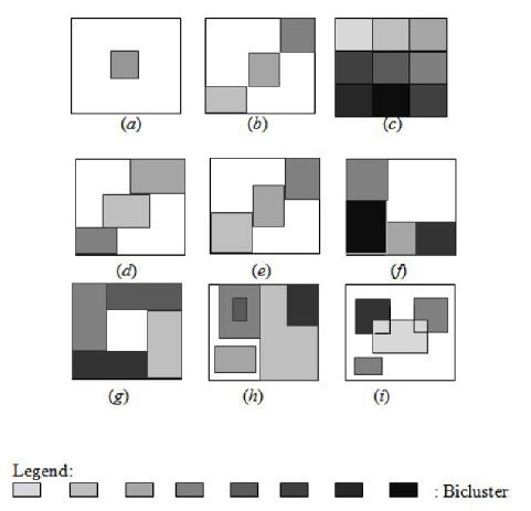
We focus our review on how to visualize more than one bicluster with overlaps in the same screen (Figure 1(h) and Figure 1(i)).
2.3. Biclustering search methods
Biclustering is a computationally complex problem, often classified as NP-hard [4], [22]. As a result, heuristic approaches are typically employed to find approximate solutions. Given the variety of biclustering algorithms based on different search strategies, the following categorization can be identified [22], [23]:
- Iterative row/column clustering: This approach is a straightforward method that involves applying clustering algorithms to both the rows and columns of the expression matrix and then combining the results to identify biclusters. It is also known as two-way clustering [24], [25] or conjugated clustering [26]. This approach inherits the same benefits and drawbacks of clustering algorithms. Examples of algorithms that follow this approach include ITWC (Interrelated Two-Way Clustering) [25], CTWC (Coupled Two-Way Clustering) [24] and DCC (Double Conjugated Clustering) [26].
- Divide and conquer: This approach begins with a single bicluster encompassing the entire data matrix. It then recursively divides this matrix into two submatrices, creating two new biclusters. This process continues until a predetermined number of biclusters are generated that meet specific criteria. By breaking down the problem into smaller subproblems, this approach aims to accelerate the search for solutions. While this method is known for its speed, it can potentially ignore valuable biclusters if they are divided before being identified [21]. Examples of algorithms that follow this approach include the Hartigan biclustering algorithm [27] and Bimax[28].
- Greedy iterative search: This approach builds a solution incrementally using a specified quality measure. In the context of biclustering, at each step, submatrices of the data matrix are constructed by adding/removing rows or columns to maximize/minimize a particular function. This process continues until no further modifications can be made to any submatrix [20]. This approach shares the same strengths and weaknesses as the divide-and-conquer method. While it may make suboptimal choices and miss good biclusters, it can be very fast [21]. Examples of algorithms that follow this approach include CCA [4], OPSM [29], xMOTIFs[30], ISA [31], MSSRCC [32], QUBIC [33], COALESCE [34], CPB [35] and LAS [36].
- Exhaustive bicluster enumeration: This approach exhaustively explores all potential bicluster groups to identify the optimal solution that maximizes a specific evaluation function. Despite the capability of finding the best results, this approach is computationally expensive (i.e., time consuming). To alleviate this, biclustering algorithms often incorporate restrictions on the size or number of biclusters or employ pre- and post-filtering techniques [28]. Examples of algorithms that follow this approach include SAMBA [37], BiBit[38] and DeBi[39].
- Distribution parameter identification: This approach employs a statistical model to estimate distribution parameters and generate data by iteratively minimizing a specific criterion. Algorithms that follow this approach are capable of identifying the optimal biclusters, if they exist. However, due to their high computational complexity, they are often limited to analyzing biclusters with a specific size [21]. Examples of algorithms that follow this approach include Plaid model [40], Spectral biclustering[41], BBC [42] and FABIA [43].
Table 1 is a summary of biclustering search methods algorithms describing their characteristics.
Table 1: Evaluation of biclustering search methods
Biclutering search method | Algorithms | Advantages | Disadvantages |
Iterative row/column clustering | ITWC [25] CTWC [24] DCC [26] | Find good results (i.e., clusters) Very fast | Sensitivity to noise datasets Scalability issues to large datasets |
Divide and conquer | Hartigan algorithm [27] Bimax[28] | Very fast | Ignore good biclusters |
Greedy iterative search | CCA [4] OPSM [29] xMOTIFs[30] ISA [31] MSSRCC [32] QUBIC [33] COALESCE [34] CPB [35] LAS [36] | Very fast | Ignore good biclusters |
Exhaustive bicluster enumeration | SAMBA [37] BiBit[38] DeBi[39] | Find best solutions (i.e., biclusters) | Very Slow Time consuming |
Distribution parameter identification | Plaid model [40] Spectral biclustering[41] BBC [42] FABIA [43] | Find best solutions (i.e., biclusters) | High complexity Time consuming |
Most of these biclustering algorithms already mentioned in the previous subsection generated generally big size biclusters as a result. In the next section, we present the techniques used to visualize biclustering results of gene expression data [17].
3. Review of previous research
3.1. Heatmaps visualization
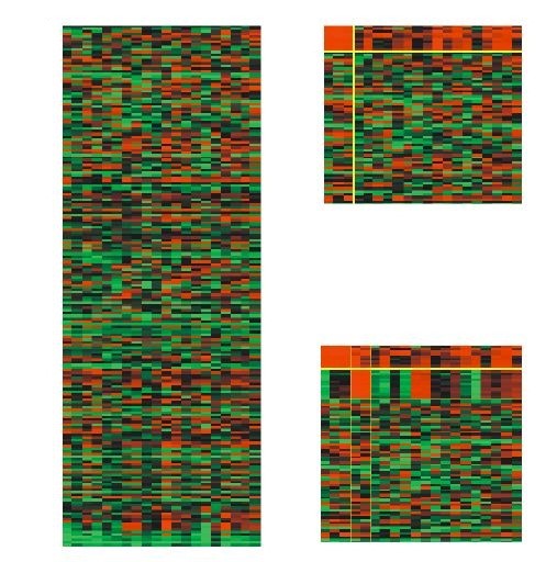
A heatmap serves as a bi-dimensional graphical representation that illustrates data values within a matrix structure. For gene expression data, the x-axis is allocated for conditions (columns) and the y-axis for genes (rows). Each matrix element aij denoting the expression level of the ith gene under the jth condition. It is depicted as a colored square (pixel) with the color intensity corresponding to a predefined scale. Typically, shades of green, red and black colors are chosen to align with the standard fluorescent dyes used in DNA microarrays: green signifies reduced expression or down-regulation, red indicates elevated expression or up-regulation and black represents a neutral expression level. To visualize a bicluster, its associated rows and columns are repositioned, generally to the top-left corner of the matrix [44]. Visualization techniques such as reordering or duplication are employed to display multiple biclusters within a single view. An example of heatmaps displaying biclusters is depicted in Figure 2.
3.1.1. Reordering techniques
To simultaneously visualize multiple biclusters, reordering is a viable strategy for heatmap representations. The literature presents various algorithms for this purpose.
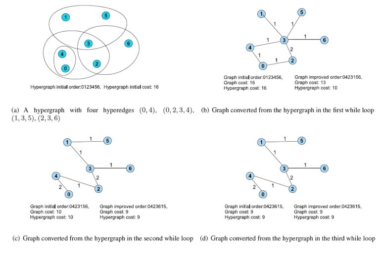
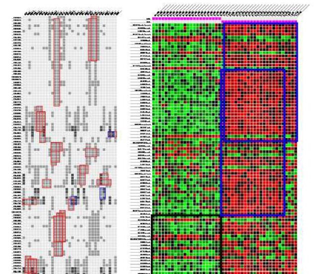
In [46], the author proposed a heuristic iterative method that approaches the visualization of overlapping biclusters as an optimization challenge. This method introduces a reordering technique that draws parallels with the hypergraph vertex ordering dilemma, an extension of the classic minimal linear arrangement or graph ordering problem. Initially, the heatmap matrix is transformed into a hypergraph which is then converted into a weighted undirected graph following a starting order that aligns with one of three predetermined configurations: a linear path, a singular loop or multiple loops. Then, the minimum linear arrangement problem (i.e., MinLA) is employed on the newly formed graph to discover an improved order. Next, the hypergraph is transformed into a different graph using the newly determined order. This iterative process continues until a satisfactory order is achieved or no further enhancements are observed. An illustrative example of this algorithm in action is presented in Figure 3.
In [47], the algorithm presented aims to optimize the layout to enhance the visualization of the largest contiguous sections of biclusters from a gene expression matrix. Initially, the data is depicted as a binary matrix with rows representing genes or conditions and columns representing biclusters. The reordering approach is independently applied to both rows and columns to improve the visual quality of the biclusters. This optimization process counts four stages: The first stage named simplify eliminates redundant rows to reduce the problem’s complexity. The second stage named prearrange seeks an optimal starting point for optimization by sequentially adding rows to a new order, ensuring each is positioned ideally. The third stage named arrange is the core of the algorithm where it aims to maximize an alignment score using a greedy strategy that repositions parts of a bicluster and permutes its constituent elements (genes or conditions) for better alignment. The final stage named complexity reintroduces the previously excluded rows into their new positions, thereby restoring the original problem’s scale. An illustration of this technique’s workflow is provided in Figure 4.
3.1.2. Duplication techniques
In certain instances within heatmap visualizations, reordering techniques can’t display all biclusters adequately. It becomes necessary to replicate rows and columns to present the biclusters as continuous segments within a single heatmap. This duplication strategy has been proposed in various studies to enhance the clarity and continuity of bicluster representation.
The algorithm introduced by [48] aims to visualize biclusters and their overlaps as continuous regions within a single heatmap. Its core concept involves duplicating rows and columns to accurately depict overlapping biclusters. This approach is influenced by the hypergraph superstring challenge which refers to the physical mapping of genomes, as investigated by [49]. The algorithm presents a technique to limit the duplication of rows and columns as much as possible. This technique is executed separately on both rows and columns. It employs a data structure known as a PQ tree[50] which is helpful to arrange all potential columns to be adjacent, duplicating them if necessary, to form contiguous biclusters. Additionally, it utilizes a sequence of REDUCE operations that hierarchically organize the rows, thereby enhancing the overall quality of the visualization. An illustrative example employing two distinct expression matrices is demonstrated in Figure 5.
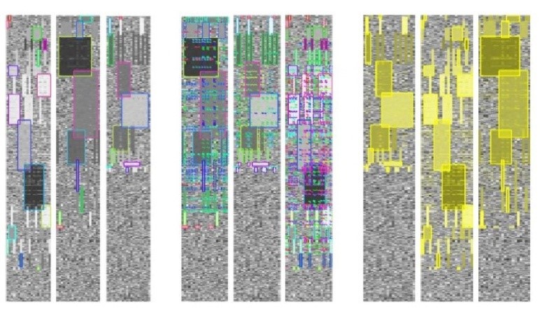
In [51], the author developed a biclustering layout algorithm alongside an interactive visualization interface for illustrating multiple biclusters. The initial phase of their algorithm involves translating the heatmap into grayscale values through linear interpolation, spanning from the minimum to the maximum values within the data matrix. Next, each bicluster is designated with a unique color. When selected, biclusters are highlighted in a semi-transparent yellow hue which merges additively in areas of overlap, although users retain the option to customize their colors. To enable analysts to selectively visualize biclusters in an adjacent manner, the algorithm incorporates both reordering and duplication strategies for rows and/or columns. This interactive feature significantly reduces the occurrence of duplicates and marginally enhances the method’s scalability. Figure 6 illustrates varied heatmap visualizations drawn from three distinct datasets containing multiple biclusters.
Despite being the most common technique for visualizing single biclusters, heatmaps have limitations in terms of geometry especially when displaying biclusters with high levels of overlap.
3.2. Parallel coordinates visualization
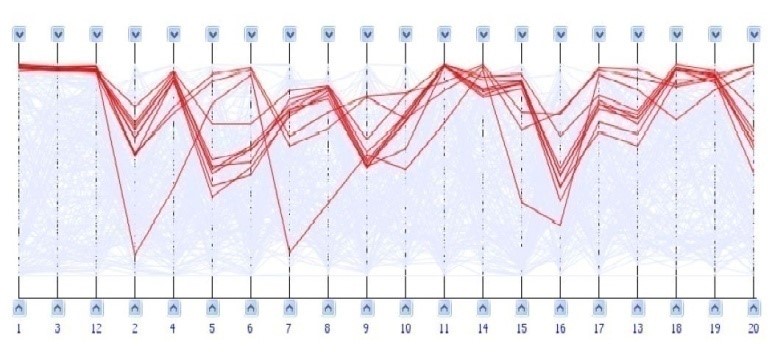
Parallel coordinates are employed as a visualization method for representing complex, high-dimensional data sets. In this technique, each dimension is associated with a vertical line and individual data points are connected across these lines to form a polyline that reflects their multi-dimensional values. This approach has been adapted for the visualization of gene expression data as well. To depict gene profiles within an m-dimensional framework, m parallel and equidistant vertical lines are drawn, each symbolizing a different experimental condition. The gene profiles are then plotted as polylines across these lines, with the position of each point on a line corresponding to the gene’s expression level under that particular condition. An example of this visualization technique, using parallel coordinates, is provided in Figure 7.
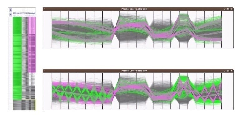
In [51], the author implemented a series of transformations to their heatmap data representation in order to facilitate the simultaneous visualization of multiple biclusters using parallel coordinates. In this adaptation, the matrix of rows is represented as lines within the parallel coordinates framework. The vertical axes are positioned to correspond with the columns from the heatmap. To depict the conditions associated with a bicluster, the method computes the mean vertical location of all lines within a bicluster, establishing reference points known as centroids. These lines are then adjusted to intersect at the centroids. Next, the biclusters are rendered in a semi-transparent black hue. The color scheme utilized for the heatmap biclusters is replicated in the parallel coordinates display. To reduce visual clutter, lines not part of the highlighted biclusters can be dimmed by the user. An illustration of this parallel coordinates visualization for two biclusters is presented in Figure 8.
Parallel coordinates are a suitable method for visualizing large biclusters or individual biclusters. However, the cluttering of polylines due to overlapped biclusters can hinder the effectiveness of this technique in displaying multiple biclusters in a single view.
In general, scalability is the primary limitation of these methods (i.e., heatmaps and parallel coordinates), whether due to the abundance of biclusters or to high rates of overlap [45].
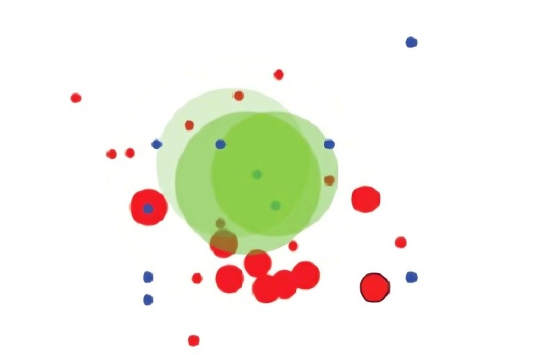
3.3. Bubble map visualization
In [45] and [52], the author presented an approach that involves the depiction of biclusters as circular entities named bubbles. The color coding of these bubbles corresponds to the sets of biclusters generated through a biclustering algorithm, with the capability to display up to three sets simultaneously. The intensity of the color, or brightness, indicates the uniformity within a bicluster. The size of each bubble is determined by the product of the number of genes and the number of conditions that constitute the bicluster. The placement of each bubble is based on a two-dimensional projection derived from multidimensional points which are the rows and columns that make up the bicluster. While this visualization method intuitively represents the arrangement of biclusters, the overlapping of bubbles does not precisely mirror the actual overlaps between biclusters. Rather, it serves as an approximation of their similarity. This technique is often employed to complement other methods, aiding in the comprehension of the general patterns observed in biclustering analyses. An illustration of this visualization method is provided in Figure 9.
Due to the limitations of heatmaps and parallel coordinates in visualizing a large number of biclusters, particularly with high levels of overlap [45], more advanced visualization approaches have been introduced. These approaches combine traditional gene expression visualization techniques (such as heatmaps and/or parallel coordinates) with set visualization techniques [53] like Venn-like diagrams [45], node-link diagrams [54] and two-dimensional matrix representations [55][56]. The following provides a description of these innovative techniques.
3.4. Venn-like diagrams visualization
Euler and Venn diagrams stand as some of the earliest techniques for illustrating sets and their interconnections. These diagrams were conceptualized by the British mathematician and philosopher, John Venn in the 18th century and have been widely adopted as effective tools for teaching concepts of set theory and logical relationships in education [57]. Utilizing a proportional-area model, where the depicted areas correspond to the magnitude of a set and its intersections, sets are symbolized by enclosed shapes on a plane, typically circles and the relationships between sets are demonstrated through the overlapping of these shapes. They offer a versatile means to represent all conceivable set relationships, including intersection, inclusion and exclusion, due to the absence of limitations on the representation of overlaps. Venn diagrams, which are a specialized variant of Euler diagrams, are capable of representing every conceivable set intersection, regardless of whether they are non-empty or not.
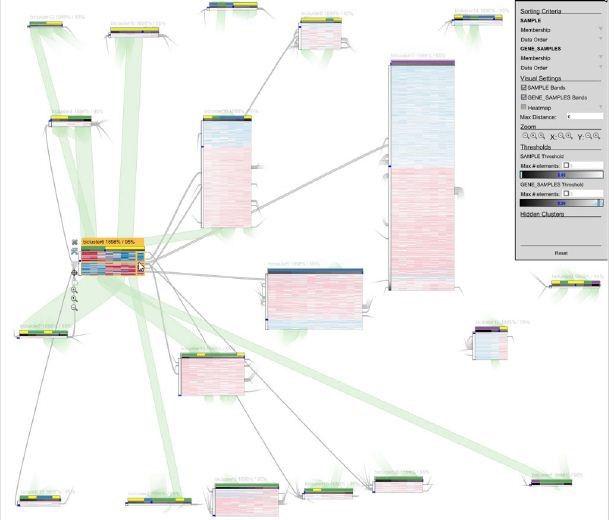
In [45], the author described a novel visualization method based on Venn diagrams was employed, where biclusters are visualized as non-uniform shapes termed as hulls and their intersections are indicated by the hulls’ overlaps. To represent genes and conditions that are unique to a single bicluster or shared among certain intersections, symbols known as glyphs are used. Each glyph is designed as a pie chart, segmented into sectors that represent the count of biclusters associated with the genes and conditions. The dimension of a glyph is indicative of the size of its respective group. The graphical representation is organized using a force-directed algorithm where biclusters are illustrated as flexible dynamic groups of genes and conditions. Specific genes and conditions related to a single bicluster or overlaps between a set of biclusters are illustrated through heatmaps and/or parallel coordinates which are displayed separately under request. While this approach effectively identifies a considerable number of biclusters with minimal rate of overlaps, its performance may degrade when faced with datasets containing a high degree of biclusters overlap. Figure 10 shows an illustration of this visualization technique.
3.5. Node-link diagrams visualization
A node-link diagram is a graphical representation, either in 2D or 3D consisting of nodes and connecting edges. This visualization technique represents various entities as nodes, also known as vertices and the connections between these entities as edges or links. Typically, nodes are symbolized by geometric shapes such as circles while the connections are depicted by lines. Creating a clear and informative graph requires careful consideration of nodes placement and edges routing, particularly when dealing with a large number of elements. Force-directed layout is commonly employed to address this challenge.
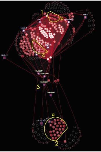
In [54], the author depicted biclusters and their intersections through a node-link graph. Here, biclusters form the nodes while the shared genes and conditions among them are represented as edges or bands. Each bicluster is visualized as a heatmap matrix where rows correspond to genes and columns represent conditions. Overlaps between biclusters are represented by connecting bands that link the corresponding heatmaps at the positions of shared genes and conditions. The thickness of these bands indicates the degree of overlap, with thicker bands signifying more shared elements. The graph layout employs a force-directed algorithm where biclusters with overlapping elements are drawn closer together. When a bicluster is selected, it reveals detailed information such as its designation or the identifiers of its genes and conditions. This visualization approach is highly interactive and straightforward since the design is based on the heatmaps visualization. The bands that indicate overlap offer the user a detailed view of the common genes and conditions found in each pair of biclusters. However, this method’s visualization of overlaps on a one-to-one basis makes it challenging to distinguish multiple bicluster overlaps easily. Moreover, the technique’s scalability is limited with an increase in overlap levels. In fact, the bands become overly congested, making it difficult to gain a comprehensive view of the biclustering outcomes. An example of this bicluster visualization method is presented in Figure 11.
3.6. Two-dimensional matrix visualization
In [55], [56] the author proposed a visualization method that takes into account the special characteristics of biclustering which are overlaps and bi-dimensionality. The primary objectives of the method are:
- Visually represent biclusters of varying sizes and degrees of overlap.
- Maintain both elements (i.e., genes and/or conditions) and biclusters information within a single view, preventing context loss.
- Avoid information simplification or duplication. While alternative approaches might offer clearer visualizations, they often ignore interesting information or introduce ambiguities.
- Provide interactive features that enable diverse perspectives and facilitate exploratory analysis.
- Increase scalability. An effective bicluster visualization method should accommodate large datasets, numerous biclusters and extensive overlaps between biclusters.
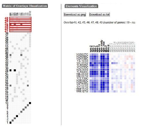
To achieve these objectives, the authors developed a visualization technique that lay out the generated biclusters as a two-dimensional matrix. Each bicluster is represented as a column and overlaps between sets of biclusters are depicted as rows. This method combines a modified set visualization technique for matrix layout with a traditional heatmap approach for visualizing individual biclusters and their overlaps as gene expression matrices [58], [53]. A user interface is implemented to query the biclusters intersection matrix and visualize matching results. The proposed technique is implemented in a web-based interactive visualization tool called VisBicluster which supports features like sorting, zooming and on-demand details. While applicable to any type of overlapping groups, the primary focus of this technique is on representing biclusters derived from gene expression data.
This approach emphasizes overlaps, making their identification and selection straightforward within the defined matrix-based visualization. By avoiding element crossings (lines, shapes, etc.), this method minimizes visual clutters. VisBicluster’s scalability is remarkable since it can efficiently display large numbers of highly overlapped biclusters simultaneously. The tool also incorporates linking and brushing techniques for inspecting selected data subsets from different perspectives. Figure 12 illustrates this visualization technique.
4. Critique of visualization methods
Our evaluation of the surveyed techniques focused on three key aspects:
- Reducing overlaps among biclusters.
- Maximizing the number of biclusters visualized within a single view (i.e., scalability).
- Ensuring clear visibility of both biclusters and their overlapping regions.
Due to their geometric limitations, heatmaps and parallel coordinates often struggle to efficiently visualize biclusters, particularly when evaluated against the criteria of overlap minimization and scalability [45]. Heatmaps, in particular, are typically unbalanced in terms of dimensions, with many more genes (around 10[3-4] rows) than conditions (around 10[1-2] columns) [19]. So, replication techniques used to visualize biclusters can lead to large matrices when visualizing multiple biclusters, making overlap perception difficult and limiting scalability. Additionally, the common use of a green-black-red color scale in heatmaps can hinder human perception of expression levels [7], [19].
Parallel coordinates often suffer from cluttering due to overlapping polylines when visualizing multiple biclusters simultaneously. This makes it difficult to perceive overlaps and limits scalability. Individual biclusters can be easily interpreted due to the human brain’s ability to recognize patterns like parallel lines, mirror effects and changes in slope [19]. However, visualizing several large biclusters with high rates of overlap in the same parallel coordinates can be in some cases impossible.
By combining heatmaps and/or parallel coordinates with more sophisticated sets visualization techniques like Venn diagrams [45], node-link diagrams [54] or two-dimensional matrix visualization [55], [56], we can confirm that the scalability and clarity of drawn biclusters are improved significantly. Representing biclusters and their overlaps as abstract elements such as hulls [45], bands between heatmaps [54] or cells in a matrix [56] can simplify the visualization. So, focusing on intersections between visualized elements (i.e., biclusters) in a global overview while providing details (i.e., gene expression levels) in a separate view as heatmaps or parallel coordinates, will alleviate the representation remarkably.
Overlap is a key aspect when visualizing biclusters and overlap-centered tasks like how many overlaps between a specific number of biclusters or what are the biclusters involved in a certain overlap, can help analysts to gain insights from visualized complex data. Visualization tools that help interpret complex analysis results without distorting or losing the original data context are crucial for understanding data. In fact, VisBicluster offers an overlap-centered solution that aids in understanding biclustering results, providing scalability for analyzing real gene expression data [55], [56].
While these three novel visualization methods (i.e., BicOverlapper, Furby and VisBicluster) offer high rate of scalability, they can still be overwhelmed by a large number of biclusters and overlaps. So, in some cases, it may be impossible to visualize all biclusters within a single view. Table 2 provides a summary of biclustering visualization techniques, outlining their key characteristics.
Table 2: Evaluation of biclustering visualization techniques visualization techniques
Biclustering visualization technique | Visualization methods | Dealing with overlaps | Scalability | Clarity of visualization | Time complexity |
Heatmap in [46] | Heatmap | Reordering of rows and columns | Low | Low | O(|X|2|V |2) +O(|X||V |)O(MinLA)*
O(|X|2|V |3) + O(|X||V |)O(MinLA)**
O(|X|2|V |2d)+O(|X||V |)O(MinLA)***
|
Heatmap in [47] | Heatmap | Reordering of rows and columns | Low | Low | O(mα) with α ∈ [1.6, 2]+ O(nα) with α ∈ [2.5, 2.7]+ |
Heatmap in [48] | Heatmap | Replication of rows and columns | Low | Low | O(mn2 + n2log n)# |
Heatmap in [51] | Heatmap | Replication of rows and columns | Low | Low | _ |
Parallel coordinates plots [51] | Parallel coordinates plots | Color polylines | Low | Low | _ |
Bubblemap[45] and [52] | circles | Intersections between circles | Medium | High | _ |
Venn diagrams [45] | Hulls, pie charts, Heatmap, parallel coordinates | Hulls intersections, Glyphs with pie chart sectors | High | High | O(n3)$ |
Node-link diagrams [54] | Heatmap, bands | Bands between rows and columns of heatmaps | High | High | _ |
Two-dimensional matrix visualization [55] [56] | Heatmap, two-dimensional matrix | Cells of the two-dimensional matrix | High | High | O(n*m)& |
Where: V is the set of vertices and X is the set of hyperedges. *If we convert hyperedges into paths or cycles. **If we convert each hyperedge into maximum valid cycles. ***If we convert each hyperedge into d arbitrary valid cycles. O(MinLA)is the time complexity of the minimum linear arrangement algorithm. +m is the number of biclusters and n is the number of elements. #n is the number of biclusters and m is the number of rows and columns in all the biclusters. $n isthe number of nodes (genes and conditions). &n is the number of biclusters and m is the total number of overlaps between biclusters. | |||||
5. Tools and datasets
5.1. Tools
Several useful tools exist that incorporate many of the biclustering visualization methods discussed in this review. Table 3 provides a summary of the key features of these tools.
- BiVoc: It is a C++ implementation that incorporates two primary programs: one for the layout algorithm and another for generating the corresponding visualization image. To address the potential issue of numerous rows and columns due to replication, a user-friendly web interface allows for the selection of specific biclusters to display [48].
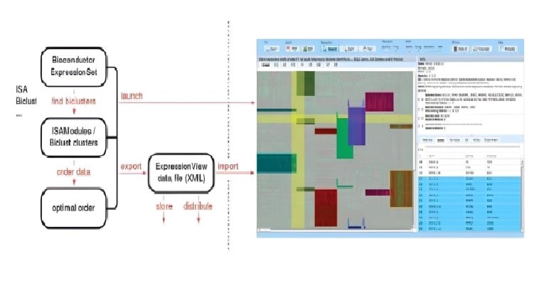
- ExpressionView: It is an R package that incorporates the developed ordering method and provides interactive visualization of bicluster results as heatmaps in a Flash applet format [47].
- Bicluster Viewer: It offers heatmap and parallel coordinates visualizations for representing biclusters as contiguous blocks. It also includes a range of interactive features [51].
- Biclust: It incorporates various biclustering algorithms and offers several visualization methods, including the Bubbleplot graphical representation that depicts biclusters as circles [52].
- BicOverlapper: It is a Java package that enables the visualization of bicluster sets using Venn-like diagrams, the representation of microarray data matrices or individual biclusters as heatmaps and/or parallel coordinates and the visualization of transcription regulatory networks. It also supports the integration of these various visualization techniques for comprehensive data analysis [45].
- Furby: It is a Java implementation of the node-link diagram technique for visualizing biclusters[54]. It incorporates several features including ordering, zooming, adjustable thresholds for different defined values, etc.
- VisBicluster: It is a web application built using JavaScript and the D3 library[60]. It enables the visualization of biclusters and their potential overlaps using the two-dimensional matrix method. Single biclusters or overlaps between two or more biclusters are depicted by heatmaps in a separate view. The software includes various integrated features such as ordering, filtering, zooming, etc. Linking and brushing between visualization techniques in VisBicluter are supported [55], [56].
Table 3: Characteristics of biclustering visualization tools
Tool | Heatmap | Parallel coordinates | Other visualizations | Degree of interactivity | accessibility | Available at |
BiVoc [48] | Yes | No | _ | Medium | free | http://bioinformatics.cs.vt.edu/~murali/papers/bivoc |
ExpressionView[47] | Yes | No | _ | Medium | free | http://www.unil.ch/cbg/ExpressionView |
Bicluster Viewer [61] | Yes | Yes | _ | High | commercial | http://www.simtech.uni-stuttgart.de |
Biclust [52] | Yes | Yes | Bubbleplot, beplot, boxplot | Low | free | https://cran.r-project.org/web/packages/biclust/index.html |
BicOverlapper [45] | Yes | Yes | Venn-like diagrams, TRN, word cloud | Very high | free | http://vis.usal.es/bicoverlapper |
Furby [54] | Yes | No | Bar chart, histogram | Very high | free | http://furby.caleydo.org |
VisBicluter [55] [56] | Yes | No | Two-diensional matrix, cells | Very high | free | http://vis.usal.es/~visusal/visbicluster |
Table 4: Gene expression datasets utilized to evaluate biclustering visualization techniques
Name | Genes | Experimental conditions | Reference |
YeastSaccharomyces cerevisiaemicroarray data | 2467 | 79 | [1] |
Prostate cancer tissuedataset | 54675 | 19 | [62] |
Human lung carcinomasdataset | 12600 | 203 | [63] |
Multiple tissue typesdataset | 5565 | 102 | [64] |
5.2. Datasets
Multiple gene expression datasets were employed to assess biclustering visualization techniques. Table 4 provides a list of some of these datasets.
6. Conclusion
While clustering focuses on identifying groups of similar elements within a dataset (gene expression data) by applying algorithms on one dimension either rows (i.e. genes) or columns (i.e. conditions), biclustering seeks to uncover patterns that exist simultaneously across both rows and columns. This added complexity (for biclustering case) necessitates more advanced visualization methods to effectively analyze gene expression data. By providing insights into the underlying relationships between genes and conditions, these visualizations can help bioinformaticians extract valuable knowledge. We present in this paper a global review that summarizes the most mentioned techniques to visualize results of biclustering of gene expression data in the literature and we evaluate them. We can mention that visualization issues such as scalability and overlaps between biclusters can be considered as open directions for academicians and researchers. As a possible solution to simplify the complexity of visualization of biclustering results, we think that the combination between traditional
visualization techniques like heatmaps or parallel coordinates and one of the novel set visualization techniques mentioned in the literature [53], can be useful [56].
Conflict of Interest
The authors declare no conflict of interest.
- M.B. Eisen, P.T. Spellman, P.O. Brown, D. Botstein, “Cluster analysis and display of genome-wide expression patterns,” Proceedings of the National Academy of Sciences, vol. 95, no. 25, 1998, doi.org/10.1073/pnas.95.25.1486
- R.. Sokal, C.. Michener, “A statistical method for evaluating systematic relationships,” Univ. Kansas, Sci. Bull., vol. 38, , pp. 1409–1438, 1958.
- J.A. Hartigan, M.A. Wong, Algorithm AS 136: A K-Means Clustering Algorithm, 1979, doi.org/10.2307/2346830
- Y. Cheng, G.M. Church, “Biclustering of expression data,” Proceedings. International Conference on Intelligent Systems for Molecular Biology, vol. 8, pp. 93–103, 2000.
- S.C. Madeira, A.L. Oliveira, “Biclustering algorithms for biological data analysis: a survey,” IEEE/ACM Transactions on Computational Biology and Bioinformatics, vol. 1, no. 1, pp. 24–45, 2004, doi:10.1109/TCBB.2004.2.
- B. Pontes, R. Giráldez, J.S. Aguilar-Ruiz, “Biclustering on expression data: A review,” Journal of Biomedical Informatics, vol. 57, pp. 163–180, 2015, doi:10.1016/j.jbi.2015.06.028.
- C. Ware, Information visualization : perception for design, Morgan Kaufman, 2004.
- B.J. Fry, Computational information design, Massachusetts Institute of Technology Cambridge, MA, USA, 2004.
- J.J. Thomas, K.A. Cook, Illuminating the path, IEEE Computer Society, 2005.
- D. Keim, K. Jörn, G. Ellis, M. Florian, Mastering the information age : solving problems with visual analytics, Eurographics Association, 2010.
- A. Holzinger, Human-Computer Interaction and Knowledge Discovery (HCI-KDD): What Is the Benefit of Bringing Those Two Fields to Work Together?, Springer, Berlin, Heidelberg, vol.8127, pp 319–328, 2013, doi:10.1007/978-3-642-40511-2_22.
- W. Ayadi, M. Elloumi, Biological Knowledge Visualization, John Wiley & Sons, Inc., Hoboken, New Jersey: 651–661, 2011.
- A. Inselberg, “The plane with parallel coordinates,” The Visual Computer, vol. 1, no. 2, pp. 69–91, 1985, doi:10.1007/BF01898350.
- D. Gonçalves, R.S. Costa, R. Henriques, “Context-situated visualization of biclusters to aid decisions: going beyond subspaces with parallel coordinates,” ACM International Conference Proceeding Series, no. 9, pp. 1–5, doi:10.1145/3531073.3531124.
- N.K. Verma, T. Sharma, S. Dixit, P. Agrawal, S. Sengupta, V. Singh, “BIDEAL: A Toolbox for Bicluster Analysis—Generation, Visualization and Validation,” SN Computer Science, vol. 2, no. 1, 2021, doi:10.1007/S42979-020-00411-9.
- M. Sözdinler, “A Review of Visualization Methods and Tools for the Biclustering,” International Journal of Innovative Science and Research Technology, vol. 6, 2021, doi.org/10.48550/arXiv.2111.12154.
- H. Aouabed, R. Santamaria, M. Elloumi, “Visualizing biclustering results on gene expression data: A survey,” ACM International Conference Proceeding Series, pp. 170–179, 2021, doi:10.1145/3473258.3473284.
- H. Aouabed, M. Elloumi, R. Santamaría, “An evaluation study of biclusters visualization techniques of gene expression data,” Journal of Integrative Bioinformatics, vol. 18, no. 4, 2021, doi:10.1515/JIB-2021-0019/MACHINEREADABLECITATION/RIS.
- R. Santamaria, Visual analysis of gene expression data by means of biclustering, University of Salamanca, Spain, 2009.
- A.V. Freitas, W. Ayadi, M. Elloumi, J. Oliveira, J. Oliveira, J.-K. Hao, Survey on Biclustering of Gene Expression Data, John Wiley & Sons, Inc., Hoboken, New Jersey: 591–608, 2012, doi:10.1002/9781118617151.ch25.
- H. Ben Saber, M. Elloumi, “Dna Microarray Data Analysis: a New Survey on Biclustering,” International Journal for Computational Biology, vol. 4, no. 1, pp. 21, 2015, doi:10.34040/ijcb.4.1.2014.36.
- S.C. Madeira, A.L. Oliveira, “Biclustering algorithms for biological data analysis: a survey,” IEEE Transactions on Computational Biology and Bioinformatics, vol. 1, no. 1, pp. 24–45, 2004.
- V.A. Padilha, R.J.G.B. Campello, “A systematic comparative evaluation of biclustering techniques,” Padilha Campello BMC Bioinforma., vol. 18, , 2017, doi:10.1186/s12859-017-1487-1.
- G. Getz, E. Levine, E. Domany, “Coupled two-way clustering analysis of gene microarray data.,” Proceedings of the National Academy of Sciences of the United States of America, vol. 97, no. 22, pp. 12079–84, 2000, doi:10.1073/pnas.210134797.
- C. Tang, L. Zhang, A. Zhang, M. Ramanathan, “Interrelated two-way clustering: an unsupervised approach for gene expression data analysis,” in Proceedings 2nd Annual IEEE International Symposium on Bioinformatics and Bioengineering (BIBE 2001), IEEE: 41–48, 2001, doi:10.1109/BIBE.2001.974410.
- S. Busygin, G. Jacobsen, E. Krämer, “Double Conjugated Clustering Applied to Leukemia Microarray Data,” IN 2ND SIAM ICDM, WORKSHOP ON CLUSTERING HIGH DIMENSIONAL DATA, 2002.
- J.A. Hartigan, “Direct Clustering of a Data Matrix,” Journal of the American Statistical Association, vol. 67, no. 337, pp. 123, 1972, doi:10.2307/2284710.
- A. Prelić, S. Bleuler, P. Zimmermann, A. Wille, P. Bühlmann, W. Gruissem, L. Hennig, L. Thiele, E. Zitzler, “A systematic comparison and evaluation of biclustering methods for gene expression data,” Bioinformatics, vol. 22, no. 9, pp. 1122–1129, 2006, doi:10.1093/bioinformatics/btl060.
- A. Ben-Dor, B. Chor, R. Karp, Z. Yakhini, “Discovering local structure in gene expression data,” Proceedings of the Sixth Annual International Conference on Computational Biology – RECOMB ’02, pp. 49–57, 2002, doi:10.1145/565196.565203.
- T.M. Murali, S. Kasif, “Extracting conserved gene expression motifs from gene expression data.,” Pacific Symposium on Biocomputing., vol. 88, , pp. 77–88, 2003, doi:10.1142/9789812776303_0008.
- S. Bergmann, J. Ihmels, N. Barkai, “Iterative signature algorithm for the analysis of large-scale gene expression data,” Physical Review E, vol. 67, no. 3 1, pp. 031902/1-031902/18, 2003, doi:10.1103/PhysRevE.67.031902.
- H. Cho, I.S. Dhillon, Y. Guan, S. Sra, “Minimum Sum-Squared Residue Co-clustering of Gene Expression Data,” in Proceedings of the 2004 SIAM International Conference on Data Mining, Society for Industrial and Applied Mathematics, Philadelphia, PA: 114–125, 2004, doi:10.1137/1.9781611972740.11.
- G. Li, Q. Ma, H. Tang, A.H. Paterson, Y. Xu, “QUBIC: A qualitative biclustering algorithm for analyses of gene expression data,” Nucleic Acids Research, vol. 37, no. 15, 2009, doi:10.1093/nar/gkp491.
- C. Huttenhower, K. Tsheko Mutungu, N. Indik, W. Yang, M. Schroeder, J.J. Forman, O.G. Troyanskaya, H.A. Coller, “Detailing regulatory networks through large scale data integration,” Bioinformatics, vol. 25, no. 24, pp. 3267–3274, 2009, doi:10.1093/bioinformatics/btp588.
- D. Bozdag, J.D. Parvin, U. V Catalyurek, “A biclustering method to discover co-regulated genes using diverse gene expression datasets,” International Conference on Bioinformatics and Computational Biology, vol. 5462 LNBI, , pp. 151–163, 2009, doi:10.1007/978-3-642-00727-9_16.
- A.A. Shabalin, V.J. Weigman, C.M. Perou, A.B. Nobel, “Finding large average submatrices in high dimensional data,” The Annals of Applied Statistics, vol. 3, no. 3, pp. 985–1012, 2009, doi:10.1214/09-AOAS239.
- A. Tanay, R. Sharan, R. Shamir, “Discovering statistically significant biclusters in gene expression data.,” Bioinformatics, vol. 18 Suppl 1, , pp. S136-S144, 2002, doi:10.1093/bioinformatics/18.suppl_1.S136.
- D.S. Rodriguez-Baena, A.J. Perez-Pulido, J.S. Aguilar-Ruiz, “A biclustering algorithm for extracting bit-patterns from binary datasets,” Bioinformatics, vol. 27, no. 19, pp. 2738–2745, 2011, doi:10.1093/bioinformatics/btr464.
- A. Serin, M. Vingron, “DeBi: Discovering Differentially Expressed Biclusters using a Frequent Itemset Approach.,” Algorithms Molucular Biology, vol. 6, no. 1, pp. 18, 2011, doi:10.1186/1748-7188-6-18.
- L. Lazzeroni, A. Owen, “Plaid Models for Gene Expression Data,” CEUR Workshop Proc., vol. 1542, , pp. 33–36, 2000, doi:10.1017/CBO9781107415324.004.
- Y. Kluger, R. Basri, J.T. Chang, M. Gerstein, “Spectral Biclustering of Microarray Data: Coclustering Genes and Conditions,” Genome Research, vol. 13, pp. 703–716, 2003, doi:10.1101/gr.648603.graph.
- J. Gu, J.S. Liu, “Bayesian biclustering of gene expression data,” BMC Genomics, vol. 9 Suppl 1, pp. S4, 2008, doi:10.1186/1471-2164-9-S1-S4.
- S. Hochreiter, U. Bodenhofer, M. Heusel, A. Mayr, A. Mitterecker, A. Kasim, T. Khamiakova, S. van Sanden, D. Lin, W. Talloen, L. Bijnens, H.W.H. Göhlmann, Z. Shkedy, D.A. Clevert, “FABIA: Factor analysis for bicluster acquisition,” Bioinformatics, vol. 26, no. 12, pp. 1520–1527, 2010, doi:10.1093/bioinformatics/btq227.
- S. Barkow, S. Bleuler, A. Prelić, P. Zimmermann, E. Zitzler, “BicAT: A biclustering analysis toolbox,” Bioinformatics, vol. 22, no. 10, pp. 1282–1283, 2006, doi:10.1093/bioinformatics/btl099.
- R. Santamaría, R. Therón, L. Quintales, “A visual analytics approach for understanding biclustering results from microarray data,” BMC Bioinformatics, vol. 9, no. 1, pp. 247, 2008, doi:10.1186/1471-2105-9-247.
- R. Jin, Y. Xiang, D. Fuhry, F.F. Dragan, “Overlapping Matrix Pattern Visualization: A Hypergraph Approach,” in 2008 Eighth IEEE International Conference on Data Mining, IEEE: 313–322, 2008, doi:10.1109/ICDM.2008.102.
- A. Luscher, G. Csardi, A. Morton de Lachapelle, Z. Kutalik, B. Peter, S. Bergmann, “ExpressionView–an interactive viewer for modules identified in gene expression data,” Bioinformatics, vol. 26, no. 16, pp. 2062–2063, 2010, doi:10.1093/bioinformatics/btq334.
- G.A. Grothaus, A. Mufti, T. Murali, “Automatic layout and visualization of biclusters,” Algorithms for Molecular Biology, vol. 1, no. 1, pp. 15, 2006, doi:10.1186/1748-7188-1-15.
- S. Batzoglou, S. Istrail, Physical Mapping with Repeated Probes: The Hypergraph Superstring Problem, Springer, Berlin, Heidelberg: 66–77, 1999, doi:10.1007/3-540-48452-3_5.
- K.S. Booth, G.S. Lueker, “Testing for the consecutive ones property, interval graphs, and graph planarity using PQ-tree algorithms,” Journal of Computer and System Sciences, vol. 13, no. 3, pp. 335–379, 1976, doi:10.1016/S0022-0000(76)80045-1.
- J. Heinrich, R. Seifert, M. Burch, D. Weiskopf, BiCluster Viewer: A Visualization Tool for Analyzing Gene Expression Data, Springer, Berlin, Heidelberg: 641–652, 2011, doi:10.1007/978-3-642-24028-7_59.
- S. Kaiser, R. Santamaria, T. Khamiakova, M. Sill, R. Theron, L. Quintales, F. Leisch, E. De, T. Maintainer, “biclust: BiCluster Algorithms. R package version 1.0.2,” 2013.
- H. Aouabed, R. Santamaría, M. Elloumi, Suitable Overlapping Set Visualization Techniques and Their Application to Visualize Biclustering Results on Gene Expression Data, Springer, Cham: 191–201, 2018, doi:10.1007/978-3-319-99133-7_16.
- M. Streit, S. Gratzl, M. Gillhofer, A. Mayr, A. Mitterecker, S. Hochreiter, “Furby: fuzzy force-directed bicluster visualization.,” BMC Bioinformatics, vol. 15 Suppl 6, no. Suppl 6, pp. S4, 2014, doi:10.1186/1471-2105-15-S6-S4.
- H. Aouabed, R. Santamaria, M. Elloumi, “VisBicluster: A Matrix-Based Bicluster Visualization of Expression Data,” Journal of Computational Biology, pp. cmb.2019.0385, 2020, doi:10.1089/cmb.2019.0385.
- H. Aouabed, M. Elloumi, “Visualizing Biclusters of Gene Expression Data and Their Overlaps Based on a Two-Dimensional Matrix Technique,” Computational Biology and Bioinformatics 2023, vol. 11, no. 2, pp. 19–32, 2023, doi:10.11648/J.CBB.20231102.11.
- M.E. Baron, “A Note on the Historical Development of Logic Diagrams: Leibniz, Euler and Venn,” The Mathematical Gazette, vol. 53, no. 384, pp. 113, 1969, doi:10.2307/3614533.
- A. Lex, N. Gehlenborg, H. Strobelt, R. Vuillemot, H. Pfister, “UpSet: Visualization of intersecting sets,” IEEE Transactions on Visualization and Computer Graphics, vol. 20, no. 12, pp. 1983–1992, 2014, doi:10.1109/TVCG.2014.2346248.
- V.I. Levenshtein, “Binary Codes Capable of Correcting Deletions, Insertions and Reversals,” Sov. Phys. Dokl. Vol. 10, p.707, vol. 10, , pp. 707, 1966.
- M. Bostock, V. Ogievetsky, J. Heer, “D3 Data-Driven Documents,” IEEE Trans. Vis. Comput. Graph., vol. 17, no. 12, pp. 2301–2309, 2011, doi:10.1109/TVCG.2011.185.
- J. Heinrich, M. Burch, R. Seifert, D. Weiskopf, “BiCluster Viewer : A Visualization Tool for Analyzing Gene Expression Data BiCluster Viewer : A Visualization Tool for Analyzing Gene Expression Data,” 2011.
- S. Varambally, J. Yu, B. Laxman, D.R. Rhodes, R. Mehra, S.A. Tomlins, R.B. Shah, U. Chandran, F.A. Monzon, M.J. Becich, J.T. Wei, K.J. Pienta, D. Ghosh, M.A. Rubin, A.M. Chinnaiyan, “Integrative genomic and proteomic analysis of prostate cancer reveals signatures of metastatic progression,” Cancer Cell, vol. 8, no. 5, pp. 393–406, 2005, doi:10.1016/j.ccr.2005.10.001.
- A. Bhattacharjee, W.G. Richards, J. Staunton, C. Li, S. Monti, P. Vasa, C. Ladd, J. Beheshti, R. Bueno, M. Gillette, M. Loda, G. Weber, E.J. Mark, E.S. Lander, W. Wong, B.E. Johnson, T.R. Golub, D.J. Sugarbaker, M. Meyerson, “Classification of human lung carcinomas by mRNA expression profiling reveals distinct adenocarcinoma subclasses,” Proceedings of the National Acad Sciences U. S. A., vol. 98, no. 24, 13790–13795, 2001, doi:10.1073/pnas.191502998.
- A.I. Su, M.P. Cooke, K.A. Ching, Y. Hakak, J.R. Walker, T. Wiltshire, A.P. Orth, R.G. Vega, L.M. Sapinoso, A. Moqrich, A. Patapoutian, G.M. Hampton, P.G. Schultz, J.B. Hogenesch, “Large-scale analysis of the human and mouse transcriptomes,” Proceedings of the National Academy of Sciences of the United States of America, vol. 99, no. 7, 4465–4470, 2002, doi:10.1073/pnas.012025199.